
Tracking workforce trends across multiple years and entities has become a critical priority for modern organizations. Yet while collecting employee information is easier than ever, visualizing it clearly for stakeholders remains surprisingly difficult. Analysts often find themselves wrestling with clunky charts that fail to tell a clear story.
This is where effective HR data analytics makes a difference. Instead of just looking at theoretical metrics, analysts need practical ways to display complex workforce dynamics without sacrificing readability. In this article, we will move beyond high-level concepts and walk through a real-world workflow for visualizing headcount and attrition using Quadratic.
The role of data and analytics in HR strategic decision-making
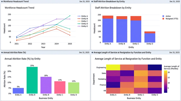
Before diving into chart mechanics, it is helpful to understand the foundational metrics that matter most to business leaders. Headcount, along with key metrics like attrition, turnover, and retention rates, forms the core of any workforce analysis. Tracking these numbers over time is exactly how data and analytics in HR strategic decision-making allow organizations to move from reactive hiring to proactive workforce planning.
When leaders have a clear view of how many employees are staying versus leaving, they can accurately forecast future hiring needs and budget accordingly. However, knowing what to track is only half the battle. The real challenge for analysts is effectively displaying this data so executives can understand entity-by-entity trends at a single glance. Applying data analytics in HR means going beyond the raw spreadsheet to deliver insights that are instantly digestible.
Bridging the gap: from HR metrics to clear visualizations
There is a common disconnect in the world of HR and data analytics. Analysts typically know exactly which metrics they need to report, but they often struggle with the mechanics of complex chart design. Standard spreadsheet tools frequently produce cluttered visuals that obscure the very trends they are meant to highlight.
To truly master HR data and analytics, professionals must adopt data visualization best practices. This includes prioritizing readability, handling small values gracefully, ensuring high font contrast, and avoiding cluttered axes. To illustrate this, we will look at a specific, real-world use case: tracking actual resignations versus remaining headcount across multiple business entities over several projected years. By visualizing these two opposing metrics together, analysts can provide a comprehensive picture of workforce stability.
Step-by-step: visualizing workforce trends in Quadratic
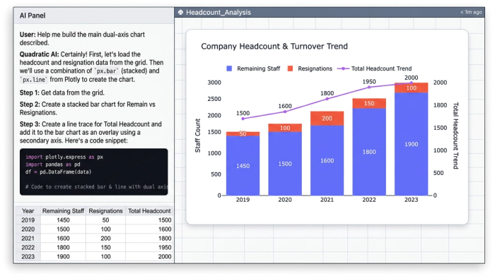
To show how these principles work in practice, we will walk through an end-to-end data analytics for HR workflow using Quadratic. Our goal is to build a clear, multi-year HR dashboard template that tracks employee movement across different financial and HR entities, providing a reliable forecast for workforce planning.
Step 1: structuring employee movement data
The first phase involves organizing the dataset within the Quadratic grid. For this use case, the data focuses on multiple entities and their respective yearly metrics. The specific data points being analyzed are the actual resign headcount and the remaining headcount, which are then projected into specific future years. By arranging this data cleanly in the browser-based canvas, the analyst sets a solid foundation for the complex visualizations to come.
Step 2: building the combined stacked bar and line chart
With the data structured, the next step is creating the core visualization. The analyst configures a stacked bar chart to represent the proportion of actual resignations versus remaining staff for each year. This immediately shows the volume of turnover relative to the total entity size.
To add deeper context, a line chart overlay is applied directly on top of the stacked bars. Layering this line chart effectively communicates the aggregate remaining headcount trend over time. This dual-axis approach allows stakeholders to see both the specific yearly turnover and the broader trajectory of the workforce in a single, unified view.
Step 3: iterative refinement for ultimate readability
A chart is only useful if it is easy to read. In this final step, the analyst addresses specific design pain points through iterative refinement.
First, label positioning is adjusted. The user refines the chart to place numeric labels directly inside the bars. This ensures immediate readability without requiring stakeholders to hover over data points to see the exact figures.
Next, legend placement is optimized. The analyst strategically positions the legend so it does not obscure the axis labels or crowd the primary data.
Finally, the analyst fine-tunes the chart to handle small values. Quadratic provides high precision in sizing and formatting, ensuring that even small numbers, like minor attrition figures, remain highly legible. These small values are displayed clearly without breaking the overall design of the chart, ensuring the dashboard effectively communicates workforce changes across all entities.
Why Quadratic is the ideal HR data analytics software
Traditional reporting tools often fail when tasked with the exact custom label positioning and dual-axis chart combinations demonstrated in the workflow above. Analysts frequently find themselves exporting data to secondary design tools just to make it presentable.
Quadratic stands out as the go-to HR data analytics software for professionals who need the flexibility of a modern spreadsheet combined with highly customizable visualization capabilities. By allowing users to connect live data, run analyses, and build intricate, highly readable charts in one place, it bridges the gap between raw HR data and executive-ready dashboards. It is a powerful tool that makes data analytics for HR faster, clearer, and far more intuitive.
Conclusion
Moving from raw workforce metrics to a fully refined, readable combined chart does not have to be a frustrating process. As we have seen, organizing entity data and layering stacked bars with trend lines can provide a crystal-clear picture of employee retention and attrition.
Effective workforce planning relies just as much on clear visual communication as it does on accurate underlying data. When stakeholders can instantly grasp the narrative behind the numbers through effective visualization, they can make smarter strategic decisions. If you are ready to elevate your reporting and build better dashboards, try Quadratic for your next HR data analytics project and experience the difference a truly modern spreadsheet can make.
Use Quadratic to do HR data analytics
- Build clear, multi-year HR dashboards that combine complex metrics like headcount and attrition into instantly digestible visuals.
- Design sophisticated combined stacked bar and line charts that clearly show both yearly turnover and overall workforce trends in a single view.
- Refine chart elements—like label positioning, legend placement, and the display of small values—directly within the spreadsheet to ensure ultimate readability and precision.
- Go from raw employee movement data to executive-ready dashboards faster, connecting analysis and visualization in one browser-based canvas.
- Gain crystal-clear insights into workforce stability and trends, enabling more accurate forecasting and proactive strategic decision-making.
Ready to elevate your HR reporting? Try Quadratic.