Purpose of this HR dashboard template
This template provides a programmable environment that centralizes core employee data into an automated reporting workspace. Unlike traditional HR dashboard templates, this python spreadsheet relies on native Python code to parse data and render visualizations, removing the need for manual chart configuration.
- Centralizes 12 key employee data points into a single automated reporting environment.
- Replaces manual chart creation with independent, Python-generated Plotly visualizations.
- This template automatically identifies flight risks, salary outliers, and workforce distribution, leveraging predictive modeling and analytics capabilities.
- Provides a structured framework and stored prompts for generating AI-driven HR action items.
Core components and data structure
HR data sheet
The foundation of this template is a dedicated data sheet that houses all employee records. It acts as the sole data source for the entire dashboard, ensuring that all charts and metrics pull from a single, consistent location.
- Contains a single master table named "HR_Employees".
- Stores 30 sample employee records across 12 distinct columns.
- Tracks IDs, names, departments, job titles, hire/termination dates, salaries, contract types, birth dates, absences, and gender.
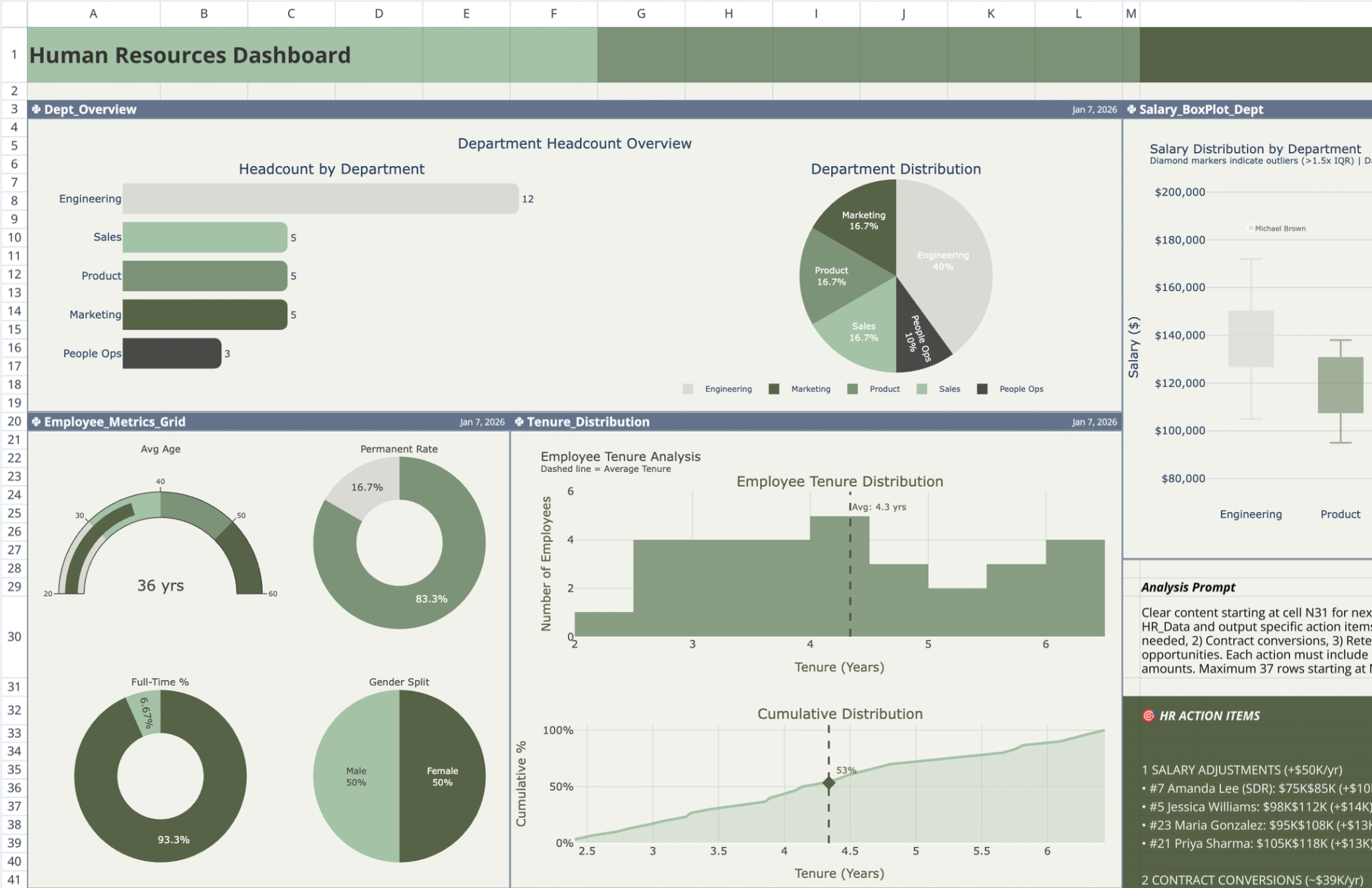
Dashboard sheet and visualizations
The dashboard sheet contains six independent Python code cells. Each cell queries the "HR_Employees" table using q.cells(), performs its own data parsing, and outputs a specific Plotly chart. None of the cells depend on the outputs of other cells.
- This headcount planning template displays a department headcount overview using side-by-side horizontal bar and pie charts.
- Shows a 2x2 employee metrics grid featuring an average age gauge, permanent-vs-fixed-term contract ratio donuts, and a gender distribution pie chart.
- Maps tenure distribution via a histogram and cumulative curve with an average percentile marker.
- Highlights salary outliers by department using box plots with 1.5xIQR fencing and individual employee name labels.
- Plots a risk bubble chart divided into four talent/risk quadrants (flight risk, key talent, growth potential, and review needed) based on tenure, salary ratio, and absences.
- Visualizes salary spend by department and role using a hierarchical treemap where size denotes total spend and color denotes average salary.
- Maintains a customized, muted earth-tone color palette across all charts against a standardized background.
AI insights and action items panel
Adjacent to the dashboard visualizations, a static text panel provides a framework for translating raw data into strategic HR decisions. This panel is manually structured rather than code-generated.
- Houses a static text panel adjacent to the dashboard visualizations.
- Includes a stored AI prompt detailing how to analyze the provided HR data.
- Categorizes pre-populated action items into salary adjustments, contract conversions, retention risks, and cost optimization.
- Summarizes the estimated financial impact of the proposed HR actions, including required investments and projected savings.
How to use this HR metrics dashboard template
For teams moving away from a standard HR KPI dashboard excel template, this setup provides a more dynamic and scalable workflow. Follow these steps to connect your own data and generate updated insights.
Inputting employee records
- Navigate to the "HR_Data" sheet and locate the "HR_Employees" table.
- Replace the 30 sample records with your organization's actual employee data.
- Ensure all 12 columns maintain the correct data types for dates, text, and numeric values so the Python scripts parse them accurately.
Interacting with the visualizations
- Run the Python cells on the "Dashboard" sheet to automatically parse the updated table data.
- Hover over specific chart elements, such as box plot outliers or treemap rectangles, to view detailed employee metrics.
- Review the risk bubble chart to identify employees falling into the "flight risk" or "review needed" quadrants.
Utilizing the AI prompt
- Copy the stored prompt from the static text panel.
- Feed the prompt alongside your updated HR data into your preferred ChatGPT alternative or other AI tool.
- Update the static panel with the newly generated action items and financial impact summaries tailored to your workforce.
Who this HR dashboard template for
- HR managers tracking departmental headcount, contract ratios, and workforce diversity.
- For compensation analysts, evaluating salary distribution and identifying pay outliers across departments requires robust compensation analysis.
- People operations teams monitoring employee retention, tenure, and flight risks.
- Department heads needing a clear, data-driven overview of team composition and salary spend.
Use Quadratic to create a comprehensive HR dashboard with AI insights
- Centralize 12 key employee data points into a single automated reporting environment.
- Generate Plotly visualizations automatically using Python, eliminating manual chart configuration.
- Automatically identify flight risks, salary outliers, and workforce distribution through predictive modeling.
- Leverage stored AI prompts to translate HR data into strategic action items.
- Track departmental headcount, contract ratios, employee tenure, and salary spend with detailed charts.
Related templates
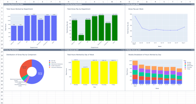
Professional Payroll Template
Automate payment calculations and spot trends with a dynamic dashboard.
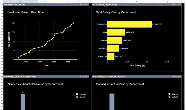
Headcount Planning Template: Variance & AI Insights
Plan and analyze employee headcount, costs, and departmental variances.
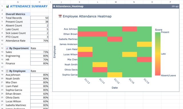
Employee Attendance Tracker with Heatmap & Summary
Track, summarize, and visualize employee attendance data.