
Operations managers face constant pressure to monitor the overall health of their organization while also understanding the specific performance trajectories of individual team members. Tracking operational performance metrics is essential for this process, but doing so effectively presents a unique challenge. Calculating the raw data is only half the battle. Visualizing those metrics clearly for stakeholders is where many workflows break down. Instead of struggling with disconnected tools, data-driven team leads are turning to Quadratic as a unified workspace to calculate, visualize, and share their most critical performance data.
What are operational performance metrics?
If you are wondering what are operational performance metrics, they are quantifiable data points used to measure the efficiency, output, and overall success of a company's daily operations. These metrics serve as the lifeblood of a business. They provide leaders with a clear picture of how well internal processes are functioning. By analyzing operations management performance metrics, decision-makers can identify bottlenecks, optimize resource allocation, and ensure that the company is meeting its strategic goals.
Operational performance metrics examples
To make these concepts concrete, it helps to look at a few operational performance metrics examples commonly used in professional services and sales, such as revenue per employee benchmarks in professional services and service request volumes. Key indicators include revenue per employee, service request volumes, and revenue generated per client engagement. While it is important to track these metrics at an aggregate level, monitoring them on an individual basis is absolutely critical for optimizing performance management in the modern workforce. Many teams struggle to build effective dashboards when dealing with a messy excel sheet and fragmented workflows.
The SERP gap: Why dashboards often fail
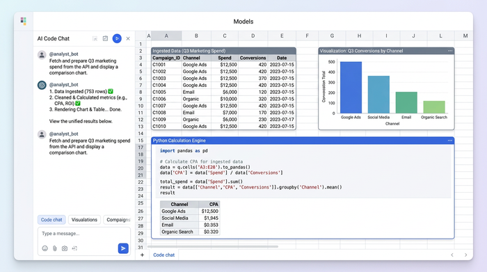
Many teams struggle to build effective dashboards because their workflows are highly fragmented. Often, analysts use one tool like a traditional spreadsheet for raw data crunching and a completely different, rigid business intelligence tool for visualization. When evaluating your broader business or operating system performance metrics, disconnecting the underlying data from the final visualization introduces the negative impact of data silos, which is a recipe for disaster. It leads to stale reports, manual update cycles, and off-brand formatting that fails to resonate with leadership. The solution is an end-to-end workflow where data ingestion, calculation, and visualization happen in a single, flexible environment.
Step-by-step: Building an individual performance dashboard in Quadratic
Consider an operations manager tasked with analyzing short-term trends for individual service delivery professionals over consecutive months. They need to build a reliable, repeatable dashboard that highlights individual trajectories within a structured performance management framework without losing sight of the bigger picture. Here is how they execute this exact workflow inside Quadratic.
Step 1: Ingesting historical transactional data
Because Quadratic functions as a collaborative sql spreadsheet that connects directly to live databases and software tools, the operations manager can easily import service request volumes and the revenue generated per client engagement. Because Quadratic connects directly to live data sources like databases and software tools, the operations manager can easily import service request volumes and the revenue generated per client engagement. To ensure privacy and accuracy, this data is meticulously organized by unique personnel identifiers rather than names. This sets a secure, reliable foundation for the analysis.
Step 2: Calculating individual trajectories and KPIs
Once the data is ingested, the number-crunching phase begins. The analyst uses the spreadsheet canvas to calculate percentage changes in core revenue-per-engagement metrics across consecutive monthly periods.
Because Quadratic operates as a native python spreadsheet supporting Python, SQL, and traditional formulas in the same grid, the analyst can use the most efficient method to process these calculations instantly. Because Quadratic supports native Python, SQL, and traditional formulas in the same grid, the analyst can use the most efficient method to process these calculations instantly.
Step 3: Applying conditional formatting and visual trend indicators
With the calculations complete, the workflow transitions from technical data processing to clear visualization. The operations manager leverages Quadratic to apply conditional formatting, color scales, and icons directly adjacent to the raw data. These visual trend indicators make performance shifts instantly readable. Instead of forcing stakeholders to interpret rows of dense numbers, the dashboard uses visual cues to highlight exactly which team members are thriving and which might need additional support.
Step 4: Enforcing strict corporate branding
A major advantage of building this dashboard in Quadratic is the ability to customize the look and feel far beyond standard spreadsheet defaults. The operations manager must ensure the final report aligns with strict corporate branding guidelines. The final output is a consolidated, beautifully formatted kpi dashboard that presents both high-level aggregate KPIs and detailed individual breakdowns.
Consolidating aggregate KPIs with granular data
The final output is a consolidated, beautifully formatted dashboard that presents both high-level aggregate KPIs and detailed individual breakdowns. By keeping the raw data, the calculation logic, and the final visualization in one place, the operations manager bridges the gap between strategic business goals and technical execution. Tracking operational performance metrics becomes a seamless process that empowers leaders to make faster, smarter decisions based on real-time individual trends.
Conclusion & call to action
Tracking individual performance trends does not require jumping between disconnected databases, traditional spreadsheets, and rigid visualization tools. With the right workspace, you can transition from raw data to a fully branded, actionable dashboard in a fraction of the time. Try Quadratic today to build your own custom performance dashboards and bring unprecedented speed and clarity to your data analysis.
Use Quadratic to track operational performance metrics
- Connect directly to live databases and APIs to pull real-time service request volumes and revenue data without tedious manual exports.
- Write SQL, Python, and traditional formulas side by side in a single grid to calculate complex individual trajectories and percentage changes.
- Build fully branded, presentation-ready KPI dashboards on an infinite canvas to eliminate the gap between raw data and final reports.
- Apply conditional formatting and visual trend indicators directly next to your calculations to make performance shifts instantly readable for stakeholders.
- Collaborate in real time with multiplayer editing, keeping operations, finance, and leadership aligned on a single source of truth.
Ready to eliminate fragmented workflows and bring speed to your operational reporting? Try Quadratic