
Table of contents
- The foundations: What is an analysis of a P&L statement?
- Key metrics for evaluating profitability
- The traditional challenge: Siloed financial workflows
- Step-by-step P&L statement analysis (a modern workflow)
- Visual storytelling: Presenting financial health to stakeholders
- Use Quadratic to do P&L statement analysis
Understanding your company's bottom line requires more than just a quick glance at net income. It requires a deep dive into the underlying profitability trends that shape long-term success. At its core, a P&L statement analysis is the process of evaluating revenues, costs, and expenses over time to understand a company's true financial trajectory.
However, most financial professionals struggle with fragmented workflows. They find themselves crunching numbers in one spreadsheet, building charts in a separate software add-in, and pasting screenshots into a presentation deck. This disjointed process slows down insights and separates the final visuals from the underlying data.
In this article, we will cover the foundational metrics of profitability. We will also walk through a modern, end-to-end workflow showing how to analyze and visualize multi-year financial trends all in one unified workspace.
The foundations: What is an analysis of a P&L statement?
The primary purpose of this evaluation is to identify the "why" behind the numbers. An effective analysis of a P&L statement reveals the specific revenue and cost drivers that influence overall performance.
Multi-year analysis is required to spot long-term trajectories, cyclical trends, and emerging risks, which is why the income statement is typically analyzed alongside a broader 3 statement financial model. Multi-year analysis—often utilizing horizontal and trend analysis techniques—is required to spot long-term trajectories, cyclical trends, and emerging risks. Ultimately, conducting a thorough financial analysis based on P&L statement data bridges the gap between raw accounting records and strategic business decisions, giving leaders the context they need to steer the company confidently.
Key metrics for evaluating profitability
Before diving into a complete workflow, it is important to understand the core metrics used in a standard P and L statement analysis. These indicators help analysts quickly assess the financial health of an organization.
Revenue growth is the top-line indicator of market traction. It measures the percentage increase or decrease in sales over a specific period, showing whether a company is expanding its market share or losing momentum.
Before diving into a complete workflow, it is important to understand the core metrics used in a standard P and L statement analysis to evaluate profitability across different operational levels. These indicators help analysts quickly assess the financial health of an organization.
Analysts also rely heavily on margin calculations to assess operational efficiency. Two of the most common metrics are EBITDA margin and EBIT margin, which is also widely referred to as the operating margin. EBITDA (Earnings Before Interest, Taxes, Depreciation, and Amortization) strips out capital structure and non-cash items, providing a clear view of pure operational profitability. The formula divides EBITDA by total revenue. EBIT (Earnings Before Interest and Taxes) includes the very real impact of depreciation and amortization. When executing complex fp&a modeling, analysts often face a significant gap in the current software landscape.
The traditional challenge: Siloed financial workflows
Financial analysts often face a significant gap in the current software landscape. Traditionally, they have to rely on static spreadsheet templates to calculate margins, switch to separate software applications to generate complex waterfall charts, and then export everything into a presentation tool to share with stakeholders.
This siloed approach creates multiple points of friction. Moving data between applications strips the numbers of their original context. When a stakeholder asks an ad hoc question during a meeting, the analyst cannot easily trace a chart back to the raw data without opening entirely different files. This disconnect slows down decision-making and turns routine reporting into a tedious manual process.
Step-by-step P&L statement analysis (a modern workflow)
Modern financial analysis requires a workspace that keeps data, logic, and visuals connected. By using an AI-powered spreadsheet like Quadratic, an analyst can perform an entire profitability evaluation on a single infinite canvas. Whether you are analyzing an established enterprise or customizing a saas financial model template, the process begins by laying out detailed financial line items across multiple fiscal intervals.
Step 1: Consolidating multi-year P&L data
The analysis begins by laying out detailed financial line items across multiple fiscal intervals. In a traditional spreadsheet, scrolling through years of raw data can feel restrictive and disorganized.
With a limitless workspace, the analyst can view sprawling multi-year financial records without ever losing track of their place. They can pull in data from various sources and arrange the raw records side by side, creating a comprehensive foundation for the analysis.
Step 2: Calculating margins and spotting the trend
Once the data is consolidated, the next step is calculating key performance indicators directly alongside the raw numbers. The analyst sets up formulas for revenue growth, EBITDA margin, and EBIT margin, comparing the results against industry-specific SaaS EBITDA margin benchmarks to contextualize performance.
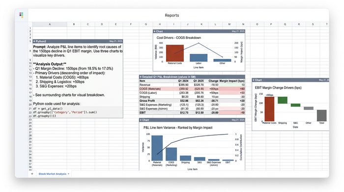
In this scenario, comparing these metrics reveals a red flag. The analyst notices a significant drop in EBIT during a specific fiscal interval, even though overall revenue has remained stable. This discrepancy signals that rising costs or asset depreciation are eating into the company's profits, prompting a deeper investigation.
Step 3: Pinpointing profitability drivers
To understand the drop in EBIT, the analyst must drill down into the underlying causes. They begin isolating specific cost categories, such as operating expenses, cost of goods sold, and depreciation.
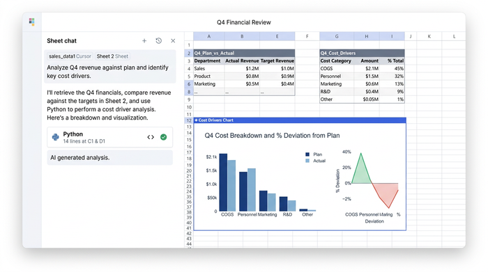
By analyzing these individual line items next to the margin calculations, the analyst can see exactly which expenses are dragging down the EBIT margin. They discover that a recent spike in equipment depreciation and a slight increase in administrative costs are the primary culprits behind the declining profitability.
Step 4: Building an EBIT bridge analysis (waterfall chart)
Identifying the drivers is only part of the process; the analyst also needs to visualize this impact. An EBIT bridge, often called a waterfall chart, is highly effective for this task. It provides a visual representation of how various positive and negative drivers bridge the gap between last year's EBIT and this year's EBIT.
Instead of exporting the data to a specialized charting tool, the analyst builds this complex waterfall chart directly on the canvas next to the data that feeds it. This eliminates the need for clunky spreadsheet add-ins and ensures that the visual remains perfectly synced with the underlying financial models.
Visual storytelling: Presenting financial health to stakeholders
To effectively communicate financial health and strategic performance, modern organizations must prioritize dynamic financial data visualization that stakeholders can easily interpret. To effectively communicate financial health and strategic performance, analysts must create comprehensive visual summaries that translate complex datasets into easily digestible stories for stakeholders.
This involves arranging multi-panel charts, applying precise formatting for percentages and currencies, and adding clear, presentation-ready titles. In a unified workspace, the analyst can format these elements to professional standards right next to the data models.
This creates a stark contrast to static presentation decks. If a stakeholder asks a specific question about the drop in EBIT during a review meeting, the analyst does not have to guess or open a separate file. They can simply pan over from the presentation-ready chart to the raw cost category data in real time, providing immediate and accurate answers.
Conclusion
A cohesive P&L statement analysis is essential for understanding the true financial trajectory of a business. From calculating foundational metrics like EBIT margins to pinpointing the exact cost drivers affecting profitability, uncovering these insights requires both rigorous data modeling and compelling visual storytelling.
Modern financial analysis demands tools that bring these two elements together. Analysts need the ability to explore raw data, build complex models, and create presentation-ready charts without constantly switching contexts.
If you are tired of fragmented workflows and static reports, it is time to upgrade your process. Try mapping out your next financial analysis on Quadratic's infinite canvas and experience a faster, more intuitive way to turn raw data into actionable business insights.
Use Quadratic to do P&L statement analysis
- Consolidate multi-year financial data on a limitless canvas to view sprawling historical records side-by-side without losing context.
- Calculate key performance metrics like EBITDA and EBIT margins using a mix of traditional formulas, SQL, and Python directly inside the spreadsheet grid.
- Connect directly to live databases and financial systems to pull real-time transaction data and automate recurring monthly or quarterly updates.
- Build complex financial visualizations, like EBIT bridge waterfall charts, on the same canvas right next to the data cells that power them.
- Present financial health to stakeholders using a single browser link, letting you pan from high-level charts to raw cost categories instantly to answer questions.
Ready to streamline your financial modeling and build clearer, connected reports? Try Quadratic