Purpose of this technical analysis template
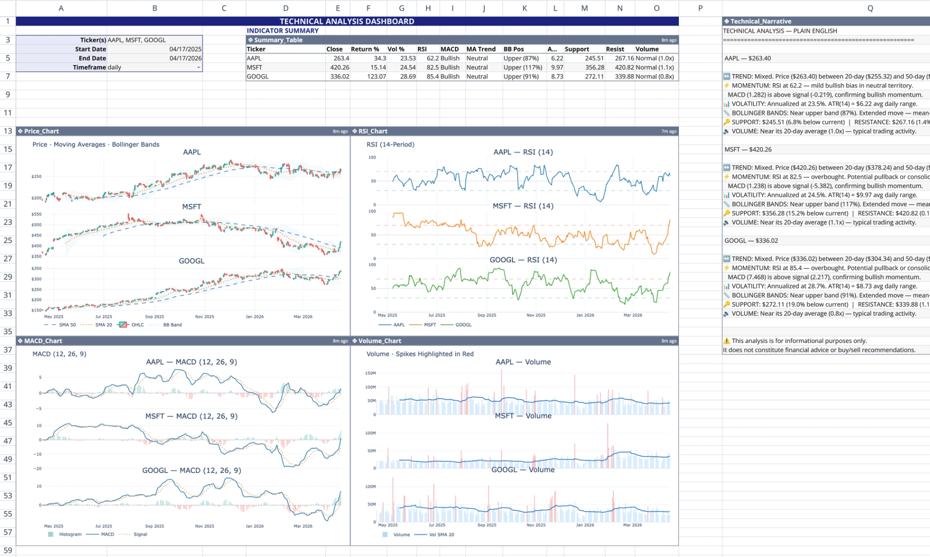
This technical analysis template functions as a self-contained live market dashboard within Quadratic. It automatically pulls real-time and historical stock data using Quadratic's stock market data API to calculate and visualize 12 standard technical indicators.
Dashboard components and layout
User input controls
The dashboard is driven by user-configurable inputs located in the top-left corner of the sheet (cells B3 through B6).
- Cell B3 accepts a comma-separated list of stock ticker symbols (e.g., AAPL, MSFT).
- Cells B4 and B5 define the analysis window start and end dates.
- Cell B6 sets the data frequency, such as daily or weekly intervals.
Data tables and narratives
The template generates two primary text and tabular outputs based on the input controls.
- Summary table (D3): Outputs a pandas DataFrame containing calculated metrics for each ticker, including RSI, MACD, annualized volatility, Average True Range (ATR), and Bollinger Band positioning.
- Technical narrative (Q1): Generates a plain-English, emoji-labeled qualitative summary that interprets trends, momentum, and volume activity for the selected assets.
Dynamic Plotly visualizations
Below the summary area, four Python code cells render a 2×2 grid of interactive Plotly charts.
- Price chart (A13): Renders candlestick charts with 20-day and 50-day simple moving average (SMA) overlays.
- MACD chart (A36): Tracks the MACD line, the 9-period signal line, and color-coded histogram bars.
- RSI chart (F13): Plots the 14-period Relative Strength Index (RSI) with dashed horizontal reference lines at 30, 50, and 70.
- Volume chart (F36): Displays daily volume bars, highlighting spikes that exceed 1.5 times the moving average in red.
How the template logic works
The dashboard operates entirely on native Python logic, requiring no spreadsheet formulas, cross-sheet references, or SQL connections.
- Reads user inputs dynamically using the
q.cells()function, ensuring changes propagate instantly to all outputs. - Executes six independent Python code cells without cross-cell variable sharing, adhering to Quadratic's scoping model.
- Scales Plotly subplot generation automatically to match the number of inputted ticker symbols.
- Utilizes
try/excepterror handling to output a graceful fallback row if a ticker fetch fails, preventing the entire output from crashing.
How to use this technical analysis document template
To begin analyzing market data with this technical analysis document template, follow these steps:
- Enter your desired stock tickers as a comma-separated list into cell B3.
- Adjust the analysis timeframe by changing the start and end dates in cells B4 and B5.
- Set the interval frequency in cell B6.
- Review the automatically updated summary table, technical narrative, and Plotly charts.
Adapting into a technical analysis report template
You can easily customize this sheet to serve as a technical analysis report template for external stakeholders or specialized research.
- Export the pandas DataFrame outputs for external reporting or documentation.
- Modify the underlying Python logic to calculate custom indicators or adjust rolling periods.
- Adjust Plotly parameters to match specific reporting formats, layouts, or corporate color schemes.
Who this technical analysis template is for
This template is designed for professionals analyzing market data and building automated workflows inside Quadratic.
- Financial analysts tracking multi-asset portfolios and market trends can leverage this template for in-depth technical analysis, often used in conjunction with fundamental analysis for a comprehensive view.
- Quantitative traders testing indicator combinations and price action.
- Python developers building automated market tracking tools and custom financial dashboards.
Use Quadratic to perform live stock technical analysis
- Get real-time and historical stock data directly from the
q.financialAPI. - Automatically calculate and visualize 12 standard technical indicators.
- Customize analysis for multiple tickers, timeframes, and frequencies using simple inputs.
- Review summary tables of key metrics and a plain-English technical narrative.
- Explore dynamic Plotly charts for price, MACD, RSI, and volume activity.
- Adapt the underlying Python logic and visuals to create custom reports and dashboards.
Related templates
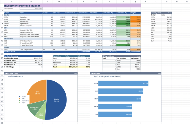
Investment Portfolio Template: Real-time Performance & Charts
Visualize and track your investment portfolio with live data.
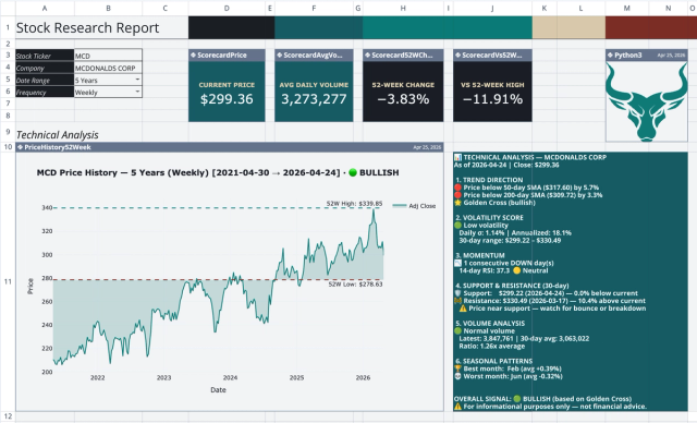
Stock Research Report Template: Live Stock Dashboard
Analyze a single stock's financial performance and risk.
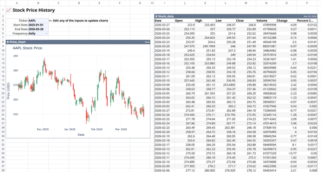
Stock History Calculator: Dynamic Price Chart
Visualize historical stock prices with customizable parameters.