Purpose of this stock research report template
This stock research report template provides a single-ticker financial research dashboard for comprehensive financial reporting, organized across four sheets. It automates the retrieval of historical price data and the calculation of technical indicators directly within the spreadsheet.
By consolidating price history, moving averages, drawdown analysis, and volatility metrics into one view, the template simplifies financial time series analysis. It also translates text-based technical analysis into dynamic visual sentiment indicators for immediate market context.
How to use the dashboard
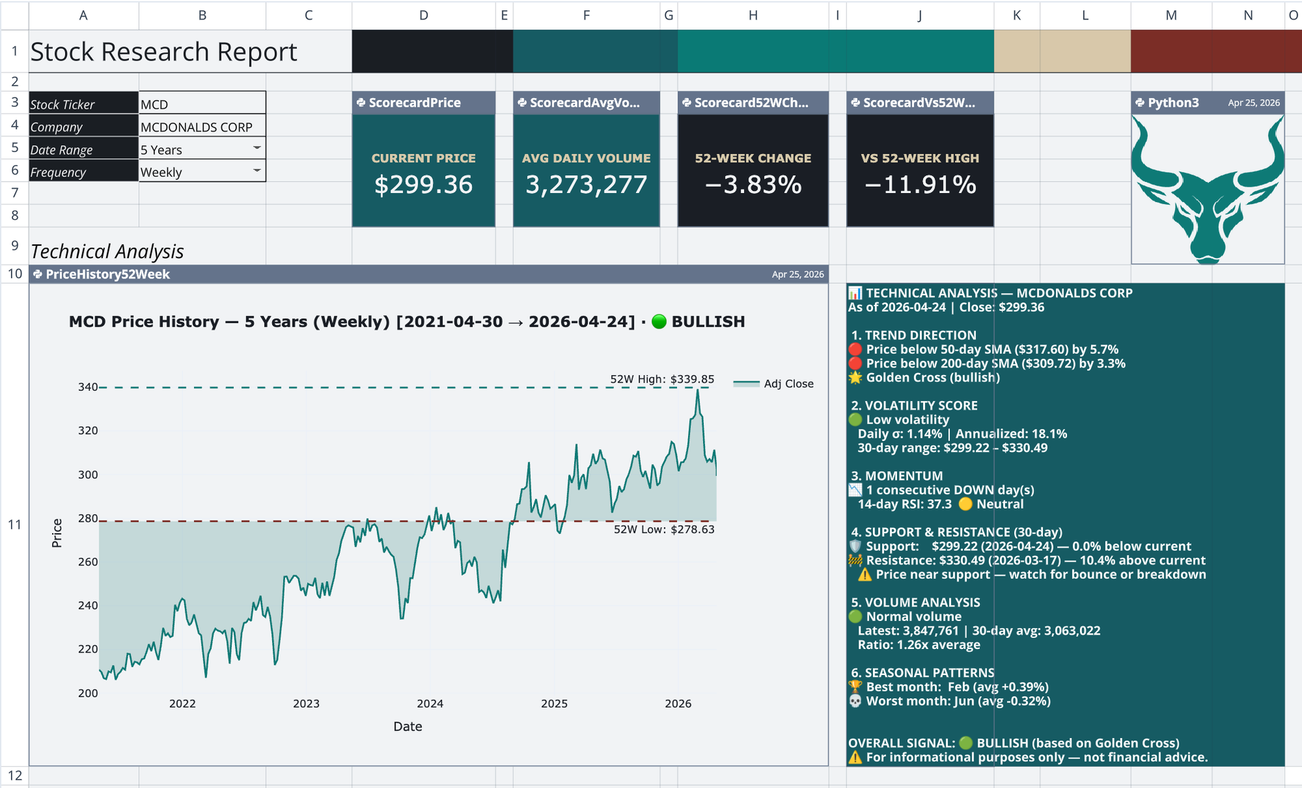
Navigate to the Main sheet to interact with the user-facing report. This primary view controls the data flowing into the underlying Python scripts and updates the entire dashboard automatically.
- Enter a target ticker symbol in cell B3.
- Define the company name label in cell B4.
- Set the lookback range in cell B5 and price frequency in cell B6.
- Edit the technical analysis text block in cell J11 to automatically trigger the bull or bear visualizer.
- Review the automatically updated KPI scorecards, risk analysis panels, and charts.
Core components of the stock research report deck template
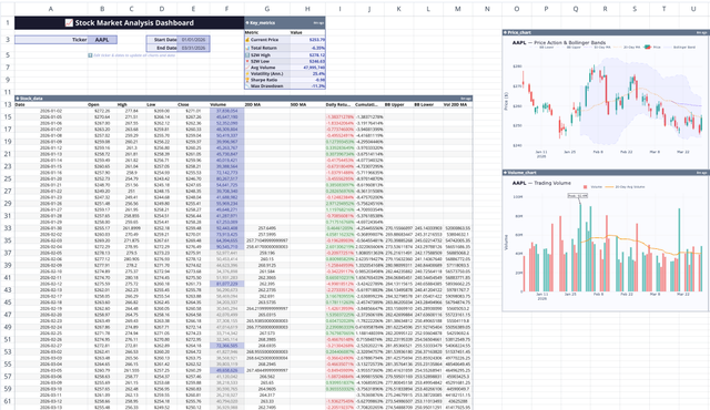
Automated data pipeline
A dedicated dataset sheet fetches market data using the q.financial.stock_prices function. It spills a comprehensive DataFrame into the grid, including adjusted close, high, low, open, and volume data. This table acts as the central data source, cascading updates to all downstream charts whenever the Main sheet ticker changes.
KPI scorecards
The template renders four Plotly Indicator cards across the top of the Main sheet. These scorecards display the current price and the trailing 252-day mean volume. They also calculate the percent change over the last 252 trading days and measure the percent gap to the 52-week high.
Price history and trend analysis
A Python cell fetches a custom series sized to the specified lookback and frequency. It calculates the 50-day and 200-day Simple Moving Averages. The script applies conditional coloring to the trend line, turning it teal for a Golden Cross and brick-red otherwise. It also plots high and low reference lines based on a separate 52-week daily series.
Risk analysis block
- Visualizes the current drop from the 52-week high using a horizontal drawdown bar.
- Plots a stacked drawdown area chart divided into severity bands of under 10 percent, 10 to 20 percent, and over 20 percent, alongside volume bars on a secondary axis.
- Computes 10-day annualized volatility and displays it on a 0 to 80 percent gauge with color-coded risk zones.
- Classifies daily volume pressure as Selling Panic, Buying Surge, or Normal based on 50-day average thresholds.
- Draws a segmented volatility crash warning chart with threshold lines and upward crossing annotations.
- Aggregates drawdown, volatility, and volume statuses into a single composite Overall Risk panel displaying Low, Medium, or High.
Dynamic sentiment visualizer
The dashboard reads the multi-section technical analysis text block on the Main sheet. It parses the text using a Python regex script to count bullish versus bearish keywords. Based on the keyword count, it selects a precomputed pixel-value matrix from backend sheets. It then renders the selected matrix as a Plotly heatmap to display a corresponding bull or bear illustration.
Who this stock research report template for
- Equity analysts evaluating single-ticker technicals and historical performance.
- Portfolio managers monitoring drawdown severity and annualized volatility.
- Quantitative researchers building automated, Python-backed financial dashboards.
Use Quadratic to do In-Depth Stock Analysis
- Automate retrieval of historical stock prices and technical indicators directly in your sheet.
- Consolidate price history, moving averages, drawdown analysis, and volatility metrics into a single view.
- Generate dynamic visual sentiment indicators from text-based technical analysis.
- Update all KPI scorecards, risk analysis panels, and charts automatically by changing a single ticker.
- Access comprehensive risk assessment, including drawdown severity and annualized volatility.
- Leverage Python scripts for robust data pipelines and custom financial calculations.
Related templates
Stock Market Analysis Template
Study the markets with an interactive spreadsheet tracking any publicly traded company.
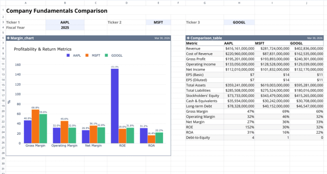
Fundamental Analysis Template: Compare Stocks
Compare fundamental financial metrics and profitability across companies.
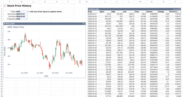
Stock History Calculator: Dynamic Price Chart
Visualize historical stock prices with customizable parameters.