Purpose of the investment portfolio template
This investment portfolio template combines manual holding data with live market price feeds to create a dynamic tracking environment. By integrating native Python and spreadsheet formulas, the template calculates real-time valuations, performance metrics, and asset weights automatically.
Users can visualize overall portfolio allocation and identify top-performing individual assets without leaving the grid. This setup provides a code-powered alternative to a static excel investment portfolio template or a standard google sheets investment portfolio template, allowing for faster analysis and automated reporting, embodying best financial reporting practices.
Key components of the investment portfolio dashboard template
The template is organized into structured sections that connect static inputs with live data and visual outputs.
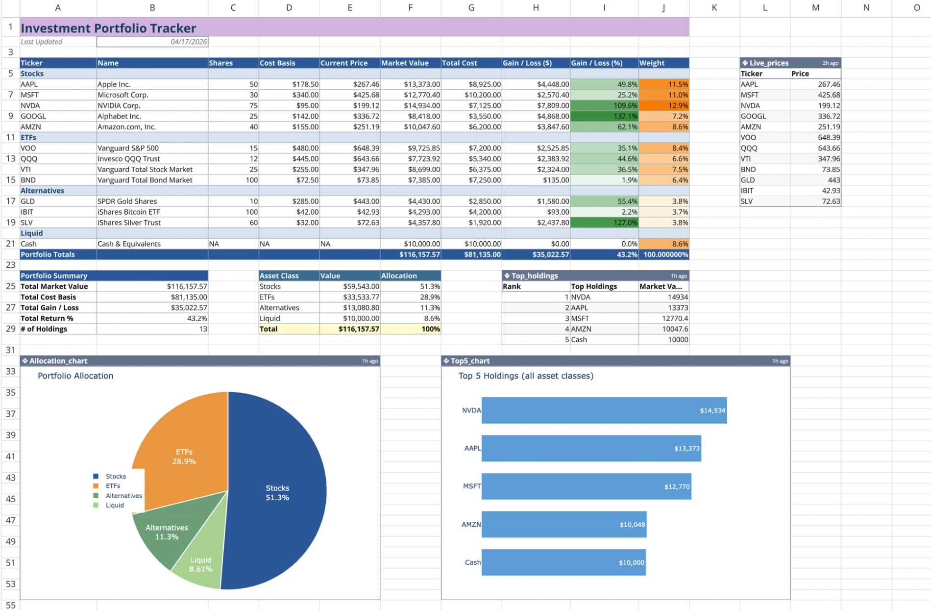
Header and holdings table
The top of the sheet features a header area that displays the current date automatically using a =TODAY() formula. Below this, the main holdings table is separated into four categorized sections: Stocks, ETFs, Alternatives, and Liquid (Cash). Each section provides static input columns for you to enter the ticker symbol, asset name, share quantity, and cost basis for your assets.
Live price feed and performance formulas
A dedicated Python code cell, often leveraging tools like yfinance python, powers the live data connection. It iterates through your provided tickers and fetches current market data using q.financial.realtime_price(). This code outputs a two-column lookup table containing the live asset prices.
From there, standard spreadsheet =VLOOKUP formulas pull the current prices from the Python output directly into the main holdings table. The sheet then calculates Market Value, Total Cost, Gain/Loss amounts, Gain/Loss percentages, and individual asset weights. This automated data retrieval replaces the manual updates required in a typical apple numbers investment portfolio template.
Portfolio summary and Python visualizations
At the bottom of the holding sections, the sheet aggregates total market value, total cost, overall gain/loss, and total return percentage using selective =SUM formulas across the asset classes.
A second Python code cell reads the sheet data, sorts it by market value, and generates a top-five holdings table. The template also renders two Plotly charts directly in the grid, providing powerful financial data visualization.
- A pie chart displaying asset class allocation percentages.
- A horizontal bar chart visualizing the top five holdings across all asset classes.
How to use the template
Entering holding data
Start by inputting your specific tickers, asset names, shares, and cost basis into the designated rows for each asset class. If you add or remove assets, adjust the total portfolio rows to ensure the =SUM ranges capture all of your new data points accurately.
Triggering real-time updates
To refresh your data, re-execute the live prices Python cell to fetch the latest market prices. Once the Python cell runs, the =VLOOKUP formulas will cascade the new prices through the Market Value and Gain/Loss columns.
The summary tables and Plotly charts will automatically refresh based on the updated spreadsheet data. You can then capture or export this updated visual output to use as an investment portfolio presentation template.
Who this investment portfolio template is for
This template is built for users who need to track and visualize financial assets efficiently.
- Retail investors requiring a reliable, real-time performance tracker.
- Financial analysts looking for a robust investment portfolio analysis excel template alternative, leveraging advanced financial time series analysis capabilities.
- Portfolio managers who want to combine traditional spreadsheet formulas with advanced Python visualizations.
- Users migrating from an investment portfolio google sheets template to a more powerful, automated environment.
Use Quadratic to Track Investment Portfolios with Real-time Performance & Charts
- Automatically calculate market value, gain/loss, and asset weights by combining your holdings with live market data feeds.
- Instantly update total cost, gain/loss amounts, and return percentages across all asset classes with a single refresh.
- Visualize overall asset class distribution and identify top-performing assets through integrated Plotly charts.
- Leverage native Python to fetch current stock and ETF prices directly into your sheet without external tools.
- Eliminate manual data entry and recalculations, ensuring your portfolio data is always current.
Related templates
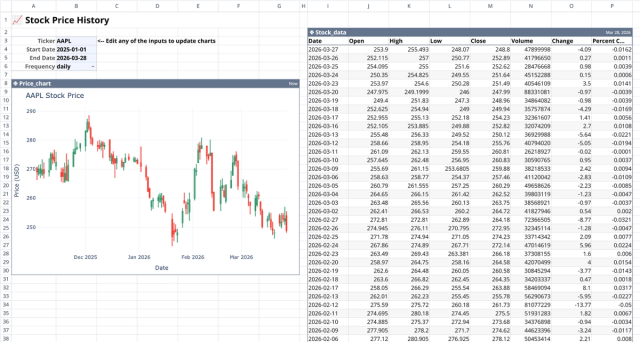
Stock History Calculator: Dynamic Price Chart
Visualize historical stock prices with customizable parameters.
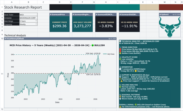
Stock Research Report Template: Live Stock Dashboard
Analyze a single stock's financial performance and risk.
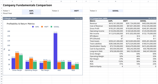
Fundamental Analysis Template: Compare Stocks
Compare fundamental financial metrics and profitability across companies.