What you’ll get
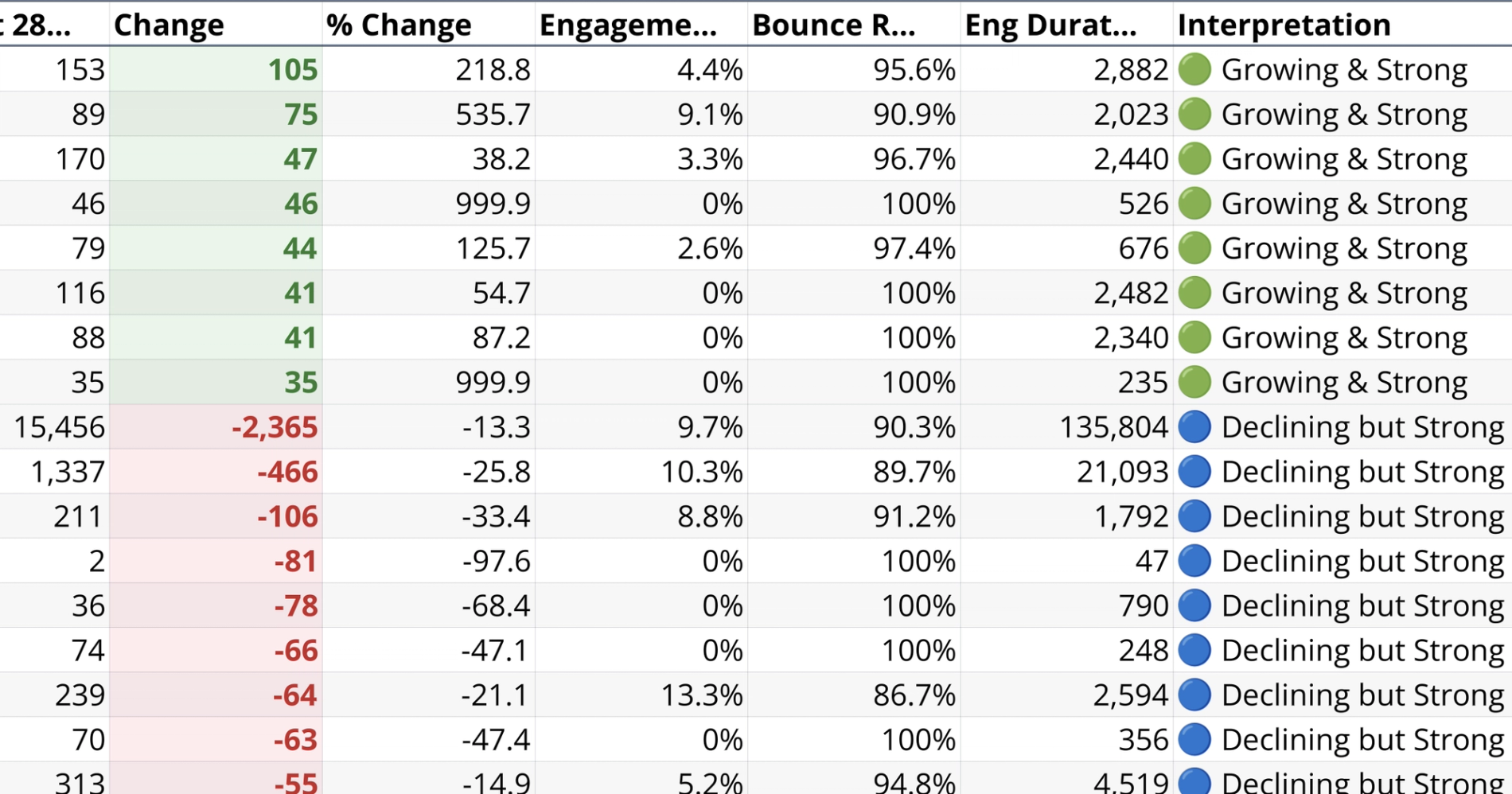
- Top movers summary table
- Movers traffic change chart
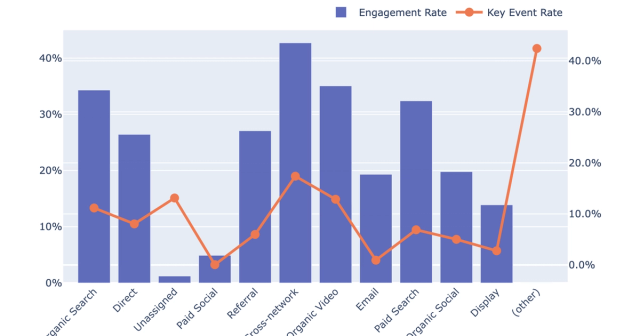
- Engagement rate scatter plot
- Key patterns takeaway summary
What this recipe does
This recipe produces a content movers report that identifies your biggest traffic gainers and decliners. Instead of looking at page views in isolation, it layers quality metrics on top of traffic data to distinguish meaningful growth from low-value noise. It evaluates page performance metrics over a configurable date window, allowing you to compare recent trends against a prior period and understand exactly how your content is performing.
What data it uses
To run this analysis, the recipe requires a connected Google Analytics data source. It uses the pages connection table as its primary source to extract the necessary dimensions and metrics.
- Extracts dimensions including the page path and hostname.
- Pulls traffic metrics such as active users and screen page views.
- Retrieves engagement fields including engaged sessions, bounce rate, and user engagement duration.
How the page engagement workflow progresses
The workflow begins with a discovery step that queries the raw data for distinct hostnames, traffic volume, and date coverage. It presents a ranked list of available hostnames so you can select the most appropriate site for your analysis.
Once a site is chosen, the recipe generates a reusable source table that aggregates all available page history. This is done without hardcoding date limits, ensuring the data remains flexible for later filtering. It sets up a dashboard controls section directly in the google analytics spreadsheet with editable start and end dates that default to a 90-day window.
The recipe then splits the dashboard date range into a recent 28-day period and a prior 28-day period for comparison. It calculates absolute and percentage traffic changes for each page path. To establish a dynamic quality threshold, it computes the median page engagement rate across your data. Finally, it assigns an interpretation label to each page based on its traffic change and engagement quality, clearly categorizing the results.
What outputs it creates
The recipe generates a custom dashboard Google Analytics with controls, visualizations, and plain-language insights to help you interpret the data.
- A visible filters panel showing the selected hostname, primary traffic metric, and comparison method.
- A summary table listing the top 15 gainers and top 15 decliners alongside their traffic and engagement metrics.
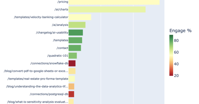
- A horizontal bar chart visualizing movers by traffic change with extreme outlier filtering applied for clarity.
- A scatter plot mapping traffic change against engagement rate, colored by interpretation label and featuring a median reference line.
- A plain-language callouts section highlighting four distinct opportunity categories, such as pages growing quickly but with weak engagement.
- A takeaway summary explaining key patterns in overall web page performance.
Optional page-level drilldown
Where the schema allows, the recipe supports deeper analysis for individual pages. It accepts a selected page path from the user and generates a specific breakdown for that URL.
- Generates a weekly traffic trend chart featuring a four-week moving average and shaded comparison periods.
- Produces a six-metric period comparison stats table for the specific page.
- Provides a narrative summary with recommended actions based on the specific page analytics, a key feature of an AI dashboard GA4.
Who this Web Page Engagement Dashboard recipe is for
- Marketing teams and site owners needing to identify which content drives meaningful traffic.
- Analysts looking to separate high-quality growth from low-engagement traffic spikes.
- Content creators prioritizing pages for refresh, promotion, or deeper investigation to improve landing page performance.
Related recipes
Quality vs Quantity Traffic by Channel
Evaluate channel traffic quality and engagement from connected GA4 data.
Landing Page Performance Analysis
Analyze GA4 landing page performance for a selected hostname.
Ecommerce Performance Analytics
Generate product and category performance insights from connected GA4 ecommerce data.