Table of contents
- Why standard chart advice falls short for real financial dashboards
- The real workflow: refining a financial bar chart in Quadratic
- What this means for building better business performance dashboards
- Why Quadratic fits this workflow
- Quick recap: steps to refine your dashboard charts
- Use Quadratic to build a business performance metrics dashboard
You build a business performance metrics dashboard, load in real revenue and profit figures, and the moment that data hits a bar chart, things fall apart. Labels overlap. Bars cluster together in unreadable knots. Department names collide with dollar figures, and somewhere in the mess sit a handful of bars for segments that had zero activity this period, cluttering a visual that was supposed to make things clearer, not messier.
Most advice on fixing this comes down to two options: round your numbers so the labels take up less space, or hide enough data points that the chart breathes again. Neither works when the audience is a CFO or a department head who, as highlighted in usability research on dashboard design, needs to see the actual figure, not an approximation. A dashboard built for exact reporting can't quietly swap $1,247,382.56 for "$1.2M" just to make the chart prettier.
This is the story of how a business analyst worked through that exact problem, not by compromising on precision, but by rethinking the workflow from the data up, using Quadratic to filter, format, and iterate until the chart was both accurate and legible.
Why standard chart advice falls short for real financial dashboards
Search for help with cluttered charts and you'll land in one of two camps. The first is high-level best-practice content based on classic declutter and focus design principles: pick between different chart types, use consistent colors, keep your titles short. Useful, but it doesn't touch the actual problem of a bar chart drowning in overlapping labels.
The second camp goes deep on formatting mechanics: leader lines, VBA macros to reposition text boxes, third-party add-ins that promise to declutter labels automatically. These guides solve a narrower problem, but they almost always lean on the same shortcut: round the numbers, or hide enough of them that the remaining labels have room to breathe.
That shortcut is fine for a marketing slide. It's not fine for a business performance management dashboard where the numbers themselves are the point. When finance and leadership teams are reviewing a financial accounting dashboard for key business performance metrics like revenue, gross profit, and net profit or loss across departments and regions, they're not looking for a rounded impression. They're looking for the number they can act on, defend in a meeting, and trace back to the source data.
So the real challenge isn't "how do I make this chart look cleaner." It's "how do I make this chart look cleaner without changing what it says." Instead of forcing a compromise between clarity and precision, there's a more direct way to work through this, starting from the data itself.
The real workflow: refining a financial bar chart in Quadratic
Starting point: messy data, cluttered chart
The analyst's starting material was a data table tracking three core metrics, revenue, gross profit, and net profit or loss, broken out by department and region. It's a familiar structure, the kind of table behind countless business performance metrics examples: rows of departments, columns of regions, and a handful of financial figures crossing both.
Charted directly, this table produced exactly the mess you'd expect. Bars for every department-region combination crowded onto one axis, data labels stacked on top of each other, and entirely useless bars for department-region pairs that had no activity at all in the period. A regional office that hadn't launched a product line yet still got its own zero-height bar and an overlapping label, adding visual noise without adding information.
Before any font tweaking or layout polishing could matter, the chart needed to stop showing things that weren't actually there.
Step one: filtering out zero-activity segments
The instinct in most spreadsheet tools is to clean this up after the fact: click into the chart, hide a series, delete a data point, maybe write an advanced autofilter Excel VBA macro that loops through and suppresses anything at zero. It works, technically, until the underlying data changes and you're back to doing it manually all over again.
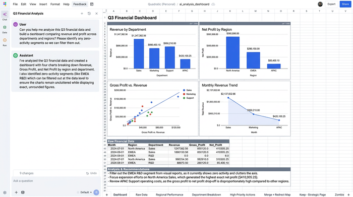
The analyst approached it differently, filtering at the data level before the chart ever got built. Using Quadratic's formulas, rows where revenue, gross profit, and net profit or loss were all zero got excluded from the range feeding the chart. The chart wasn't hiding empty segments, it simply never received them in the first place.
This distinction matters more than it sounds. A chart built on filtered, structured data stays clean automatically as new data comes in. A chart that's been manually cleaned up after the fact needs that cleanup redone every single time the source table updates. For a dashboard meant to be refreshed regularly, that's not a minor difference.
Step two: preserving exact, unrounded values in data labels
This is where the workflow broke from convention most directly. The typical fix for label overlap is rounding: turn $1,247,382.56 into $1.2M, shorten five figures into two, and suddenly there's room to breathe. For a lot of dashboards, that's a reasonable trade.
It wasn't one here. The stakeholders reviewing this executive dashboard needed the exact figure, not a rounded stand-in. Net profit or loss numbers in particular tend to matter down to the dollar when they're informing budget conversations or performance reviews. Abbreviating them wasn't a formatting choice, it was a data integrity problem waiting to happen.
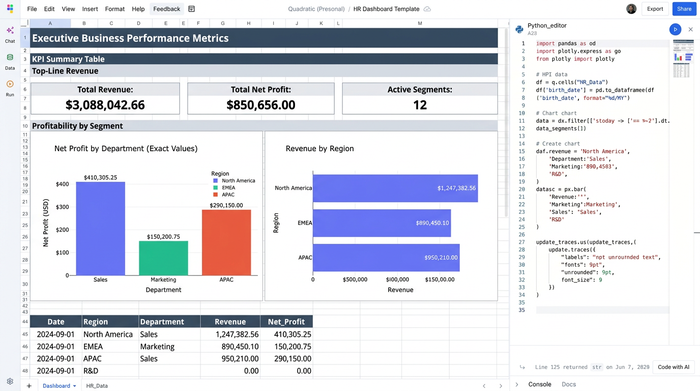
Instead of choosing between legible and precise, the analyst formatted the data labels within Quadratic to display full, unrounded values while still working inside the visualization itself. There was no need for formula hacks to build custom label text or a third-party add-in to override default number formatting. The chart kept its exact numbers, and the formatting work happened directly alongside the data it was pulling from.
Step three: iterating on font size and layout to eliminate overlap
With zero-activity noise filtered out and full precision preserved in the labels, the remaining problem was a classic layout challenge: making overlapping data labels fit without piling on top of each other.
This part of the process was straightforward trial and error, adjusting font size down a notch, checking how the chart rendered at different sizes, confirming every department and region segment was still legible, then repeating. What made this fast wasn't a special layout tool or an Excel AI graph generator, it was that the chart stayed connected to structured data the whole time. Changing a font size setting didn't require re-dragging text boxes or manually repositioning individual labels one by one, the kind of tedious cleanup that VBA-based tutorials exist to automate in traditional spreadsheets.
Because the chart was built on top of filtered, formula-driven data, every adjustment applied cleanly across the whole visualization at once. That's a meaningfully different experience than nudging labels around by hand and hoping the layout holds the next time the data refreshes.
The result: a clean, precise, presentation-ready chart
What came out the other end was a bar chart showing revenue, gross profit, and net profit or loss across departments and regions, with every zero-activity segment removed and every remaining value displayed in full, exact figures with no overlap.
Nothing about the underlying numbers changed. What changed was whether a stakeholder glancing at the dashboard could actually read it, trust it, and act on it without squinting at a wall of overlapping text. That's the difference between a chart that technically contains the right data and one that's actually ready to sit in front of leadership.
What this means for building better business performance dashboards
The specific problem here was overlapping labels on a financial bar chart, but the underlying lesson generalizes well beyond this one use case. A business performance dashboard is only as useful as its readability, and readability shouldn't come at the cost of accuracy. Anyone building one eventually runs into the same tension between fitting more information on screen and keeping every number exact.
That tension shows up at smaller scale too. A dashboard tracking small business performance metrics, say revenue and expenses across a handful of service lines rather than enterprise departments, faces the same clutter problem the moment a slow month produces a few zero-activity rows. The fix is identical: filter at the data level, keep full precision, adjust layout iteratively.
The same three-step approach also extends to other key business performance metrics beyond revenue and profit. Tracking the churn vs retention rate, gross margin, headcount by department, average deal size, any metric that gets segmented across categories will eventually run into the same overlapping-label problem once real data replaces sample numbers. Filter out the noise, preserve the exact values, and iterate on layout until it's legible. The specific metric changes, the workflow doesn't.
This is also where the choice of business performance dashboard software starts to matter. When building dashboards in Excel, tools that separate the chart from the underlying data structure tend to push users toward manual workarounds, hiding series, dragging labels, writing macros, every time something changes. A tool where the chart stays tied to formula-driven, structured data behaves differently: fix the data, and the chart follows.
Why Quadratic fits this workflow
Three specific friction points made this workflow harder than it needed to be in a typical spreadsheet: getting rid of zero-activity clutter without deleting rows by hand, keeping exact financial figures instead of rounding them away, and adjusting layout without seeking alternatives to VBA or repositioning text boxes one at a time. Quadratic addressed all three by keeping the chart connected to the data and formulas driving it, rather than treating the chart as a separate object to be manually cleaned up after the fact.
That's really the throughline of Quadratic as a spreadsheet: it combines the formula logic and precision of a coding environment like Python and SQL with the visual, drag-and-drop familiarity of a spreadsheet grid. For an analyst who wants control over exactly how a chart filters and formats data, without needing to learn a macro language or install an add-in to get there, that combination is what makes iteration fast instead of tedious.
If you're refining your own business performance metrics dashboard and running into the same overlap-versus-precision trade-off, it's worth trying this filter-first, precision-preserving approach in Quadratic before reaching for the rounding shortcut.
Quick recap: steps to refine your dashboard charts
- Filter out zero-activity segments before charting, at the data level, not by hiding series afterward.
- Preserve exact, unrounded values in data labels, especially for financial metrics that need to hold up under scrutiny.
- Iteratively adjust font size and layout, checking readability as you go rather than settling on the first pass.
- Validate readability across every department and region segment before calling the chart dashboard-ready.
Use Quadratic to build a business performance metrics dashboard
- Filter out zero-activity departments and regional segments at the data level using formulas, keeping your charts clean automatically as your data updates.
- Maintain exact, unrounded financial metrics in your data labels so leadership gets the precise figures they need without visual overlap.
- Iterate on chart layouts and font styling directly alongside your data, eliminating the need for manual text-box adjustments or complex VBA macros.
- Connect directly to live databases and APIs, combining SQL, Python, and spreadsheet formulas to clean and prepare your metrics in a single workspace.
Ready to build clean, audit-ready dashboards that stay accurate and legible? Try Quadratic
