
James Amoo, Community Partner
May 19, 2026

Table of contents
- What an AI Excel graph generator actually does
- Step 1: Prepare and clean spreadsheet data with AI
- Step 2: Choose the right chart type for the data relationship
- Step 3: Generate the graph from your spreadsheet
- Step 4: Turn individual charts into a refreshable dashboard
- Step 5: Use AI to explain charts to non-technical stakeholders
- How Quadratic fits the dashboard-first workflow
- Conclusion
- Frequently asked questions (FAQs)
Most teams know the routine. A stakeholder asks for a chart. You open the spreadsheet, clean a few columns, insert a chart, paste it into a deck, and move on. Two weeks later, the data has changed, and the request comes back. You repeat the entire process from scratch.
This is the hidden cost of one-off charting. Every reporting cycle means rebuilding visuals, re-cleaning data, and re-checking references that quietly broke when someone added a column or renamed a sheet. The chart that lived in last quarter's review doesn't match the one in this quarter's, and no one is sure which is right.
Even if you know how to generate graph in Excel through built-in suggestions, you are still producing a disposable artifact tied to a single moment in time. The go-to workflow is to use an Excel AI graph generator or AI data visualization tool that allows you to consolidate data ingestion, analysis, visualization, and spreadsheet automation in a single environment.
What an AI Excel graph generator actually does
An Excel AI graph generator is a tool that reads spreadsheet data, infers its structure, and either suggests or builds appropriate visualizations, with the best tools also explaining what those visualizations mean. The category is broader than it sounds, and the tools available range from lightweight chart suggesters to full dashboard builders.
It helps to think in three capability tiers when evaluating any AI Excel graph generator:
- Chart suggestion: The tool looks at your data and recommends a chart type, but you still build it.
- Chart generation: The tool produces the chart from a prompt or selection, often with sensible defaults for axes, labels, and colors.
- Dashboard generation with summaries: The tool generates multiple coordinated visuals, refreshes them as data changes, and writes natural-language explanations of what each chart shows.
When comparing options for AI for Excel graphs, the features that separate good tools from great ones are data cleaning support, chart-type intelligence (picking the right visual for the question, not just the data), data transformation without rebuilding, and the ability to produce written summaries alongside the visuals.
Step 1: Prepare and clean spreadsheet data with AI
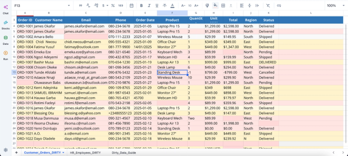
Stale data breaks charts in ways that are easy to miss until a stakeholder points them out. The most common data quality issues confirm that inconsistency, incompleteness, and duplication are the leading culprits of wrong insights generation. Inconsistent column types, blank rows, mixed units (USD and EUR in the same column), and date strings that look like dates but are stored as text produce visuals that are technically correct and practically misleading.
This is where AI spreadsheet analysis becomes valuable, long before any visualization is created. Instead of manually cleaning every issue, teams can use AI-assisted workflows to standardize column names and data types across sheets, automate Excel formatting, and reshape datasets to support multiple chart types cleanly. AI can also help identify missing values instead of silently excluding them from calculations and visualizations.
The output of this step matters more than the chart you produce next. A clean table can power five charts in a dashboard. A messy one will fight you every time you try to extend it. If you are still asking how to generate a graph in Excel and getting unreliable results, the answer is almost always upstream in the data, not in the chart settings.
Step 2: Choose the right chart type for the data relationship
Choosing a chart is really about choosing the relationship you want the audience to notice first. Different chart types are optimized for different analytical questions, and matching the visual structure to the underlying relationship is what makes a chart immediately understandable. Line charts are generally best for trends over time, while bar and column charts work better for comparing categories against one another.
AI becomes most valuable during this stage when you frame the request around the analytical question instead of simply asking for a visualization. A prompt like “show me the sales trend over the last 12 months by region” gives the model enough context to reason about time-series analysis and grouped comparisons, whereas “make a chart of this table” forces it to guess the intent. Even then, chart selection still requires human review because technically correct charts can still communicate the wrong emphasis or obscure the actual insight.
Many common visualization mistakes stem from selecting charts that do not align with the audience or the data relationship itself. A line chart used for unrelated categorical comparisons can imply continuity where none exists, while overloaded visuals with too many data series quickly become unreadable. Missing units and unclear legends further reduce interpretability. Visual complexity also needs to match the audience’s familiarity with data analysis.
AI-assisted workflows can help reduce these issues by identifying mislabeled axes, suggesting cleaner encodings, and recommending more appropriate chart structures based on the analytical goal. Visualization quality is about whether the viewer can correctly interpret the relationship that the data is trying to communicate.
Step 3: Generate the graph from your spreadsheet
Once your data is clean and you know the relationship you want to show, generating the chart is the easy part if you prompt well. Strong prompts for an Excel graph generator AI share three elements: the question, the columns to use, and the audience. A prompt like "Make a chart from this data" is weak. To get more tailored results, users can leverage a stronger prompt: "Create a line chart showing monthly revenue from the revenue column over the month column for the last 12 months. Audience is the executive team, so keep labels concise and highlight the most recent month."
Look at the first output, identify what is misleading or unclear, and feed that back as a follow-up prompt. This is faster than trying to engineer a one-shot perfect prompt and produces better results.
Whether you are using a free AI Excel graph generator or a paid platform, the key step most people skip is locking the chart specification once it works. Save the prompt, the columns it depends on, and any cleaning steps as a reusable unit. That is what makes step four possible.
Step 4: Turn individual charts into a refreshable dashboard
A dashboard is not a collection of charts. It is a small set of charts answering a recurring set of questions for a specific audience, designed to be refreshed without being rebuilt. If you want to create a dashboard in Python, AI can generate the code in seconds rather than days.
The mindset shift is mechanical as much as it is strategic. Instead of pasting a chart into a deck, you keep the chart connected to its data source and re-run the same prompts and logic against new data. The visual updates, the underlying calculations update, and the structure stays the same.
A few functional layout principles dashboards stay useful: order charts by the importance of the question they answer, not by visual weight. Keep time ranges consistent across charts so comparisons make sense. Use shared filters (date range, segment, region) so users can pivot the whole view at once. Group related charts so the eye moves from question to answer naturally.
Step 5: Use AI to explain charts to non-technical stakeholders
A chart is only useful if the reader understands it. To summarize Excel data for non-technical audiences, AI-generated plain-language callouts are the fastest path. This is the underrated half of charting, and it is where AI summaries quietly do the most work.
A strong chart summary should answer three questions clearly: what the chart shows, what changed compared to the previous period, and why that change matters. Pairing every visualization with a short explanation transforms a dashboard from a collection of isolated charts into a guided analytical workflow. This is especially valuable for executives or cross-functional teams who may not have the technical background to interpret complex visualizations quickly but still need to make timely decisions based on the data.
The quality of the summary depends heavily on the prompt. Providing context about the audience and decision-making goal helps AI generate more useful explanations. For example, asking AI to “write a two-sentence summary for a marketing director focused on weekly performance changes” produces a much more actionable result than a generic “summarize this chart” request. Context forces the model to prioritize relevance over description.
How Quadratic fits the dashboard-first workflow
Quadratic offers a better workflow than a typical Excel AI graph generator. It offers a single environment for data ingestion, analysis, and dashboard creation. This means users do not have to export their dataset to a dedicated graph generator to create interactive dashboards. Let’s explore the features of Quadratic in detail.
Build dashboards directly on top of live operational data
Most traditional Excel AI graph generator workflows stop after creating a single chart. The user still has to manually clean data and rebuild visualizations every reporting cycle. Over time, the dashboard becomes a fragile collection of disconnected charts rather than a reusable analytical system.
Quadratic is designed around a dashboard-first workflow where the data pipeline, analytical logic, visualizations, and reporting layer all exist in the same browser-based workspace. Instead of importing static CSV exports repeatedly, users can connect directly to APIs, databases, spreadsheets, and live operational systems.
The underlying data connections remain persistent, so dashboards become reusable analytical assets instead of one-time reporting artifacts. When the source data changes, the connected charts, calculations, and summaries refresh automatically without requiring manual rebuilding.
Build advanced dashboard logic with Python and SQL
As dashboards become more sophisticated, formula-only workflows become difficult to maintain. Complex transformations, predictive analytics, and multi-source joins quickly exceed what is practical in traditional spreadsheet formulas alone.
Quadratic solves this by combining spreadsheets with native Python and SQL execution directly inside the same grid. Users can perform advanced transformations, forecasting, or custom business logic without leaving the dashboard environment.
For example, Python can be used to streamline financial reporting or run advanced analytical pipelines directly alongside spreadsheet data. SQL for data analytics can query and aggregate large operational datasets without requiring external BI tools.
Use AI to clean and structure messy reporting data
One of the biggest bottlenecks in dashboard creation is preparing inconsistent data for analysis. Duplicate entries, missing values, and fragmented exports often consume more time than building the charts.
Quadratic allows users to use AI agents for data analysis directly inside the spreadsheet to clean and structure incoming datasets before visualization begins. Users can ask the AI to standardize categories, detect anomalies, identify missing records, reformat columns, or generate calculated fields directly within the grid.
Quadratic AI operates alongside the actual dataset, so transformations happen in context rather than through disconnected external tools. This accelerates dashboard preparation workflows for finance, operations, and business intelligence use cases.
Let’s see how this works. First, I import my data from Excel:
This dataset contains several inconsistencies, including duplicate rows, wrong date formats, and invalid data. With Quadratic, you do not need to write complex formulas or scripts to clean this data before visualization; all you need to do is ask using text prompts:
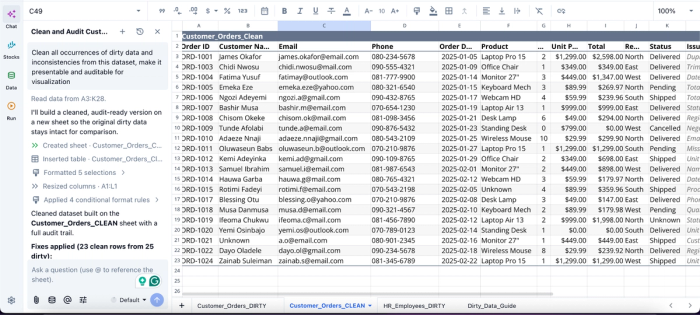
In this image, I ask Quadratic AI to “Clean all occurrences of dirty data and inconsistencies from this dataset, make it presentable and auditable for visualization.” It creates a separate sheet that presents the cleaned dataset free from all dirty data. It also provides a fully transparent logic that allows users to audit the process behind the result.
Generate contextual charts instead of isolated visuals
Most AI graph generators focus only on chart syntax. They create a visualization but lack understanding of the broader analytical context surrounding the data. Users still need to decide whether the chart actually communicates the right business insight.
Quadratic extends beyond simple chart generation by allowing users to ask analytical questions directly inside the workspace. Instead of merely generating a graph, users can ask the AI to identify trends, compare periods, or recommend the best visualization for a particular business question.
For example, a finance team could ask the AI to visualize monthly expense volatility, compare forecast accuracy across quarters, or identify which revenue segments contributed most to variance. The charts are generated alongside the live data and formulas, so users can immediately validate the logic driving the visualization.
Here’s an example:
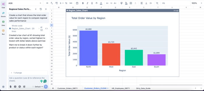
In this image, I ask Quadratic AI to “Create a chart that shows the total order value for each region to compare regional sales performance.” In seconds, it generates a bar chart that shows the total order value by region. From this chart, we can see that the North region has the highest order value with $5,880.
Keep dashboards auditable and collaborative
Many dashboard workflows become difficult to maintain because the logic lives across disconnected systems. Data processing may happen in one script, formulas in another spreadsheet, and final charts inside a BI platform. This fragmentation makes debugging and collaboration difficult.
Quadratic keeps the entire workflow visible inside a single collaborative workspace. Data connections, formulas, Python scripts, SQL queries, charts, and AI-generated summaries all remain accessible within the same file. Anyone reviewing the dashboard can inspect how calculations were built, where the data originated, and how the final visualizations were generated.
Conclusion
The win is not a faster chart. It is a dashboard that updates and explains itself, built once and refreshed on demand. The full workflow is clean, choose, generate, explain, and refresh, with AI assisting at every stage rather than only the middle one.
If you are still producing one-off charts every reporting cycle, the leverage is in moving up a level. Stop optimizing the chart. Start building the dashboard around it.
Quadratic allows you to use AI to generate charts, summaries, and dashboards from your data. It is the fastest way to see what an Excel AI graph generator looks like when it is built for repeatable dashboards instead of disposable charts. Try Quadratic for free.
Frequently asked questions (FAQs)
Can AI generate graphs in Excel automatically?
Yes. Modern AI tools can read your spreadsheet and produce the visual based on a prompt describing the question and columns. The ability to generate a graph automatically is now table stakes; the bigger differentiator is whether the tool also helps you clean data, explain results, and refresh the chart later.
Is there a free AI Excel graph generator?
Several free and freemium options exist, ranging from add-ins inside Excel itself to standalone web tools. The trade-offs are usually around data size limits, refresh frequency, integration with live data sources, and whether the tool can produce written explanations alongside charts. A free AI Excel graph generator can be a fine starting point for one-off charts, but for recurring dashboards with multiple stakeholders, the limitations show up quickly.
How does Quadratic help with building reusable dashboards?
Quadratic combines data cleaning, chart generation, and written summaries in a single browser-based workspace, so you can build a dashboard once and refresh it automatically as data changes. Unlike a traditional Excel AI graph generator that ends at the chart, Quadratic keeps your prompts, code, and visualizations editable in the grid, making it simple to re-run the same analysis against new data without rebuilding from scratch.