James Amoo, Community Partner
Mar 30, 2026

For many SMB finance teams, the month-end reporting cycle is a frustrating, manual, and error-prone scramble. Pulling data from multiple systems and pasting tables into a slide deck leaves little time for actual strategic analysis.
If you want to break this cycle, you need the best accounting dashboard for financial reporting. A truly valuable dashboard is built on a foundation of clean and continuously updated data. It should unify inputs from across your financial stack and eliminate the need for repetitive manual intervention. This ensures that reports are not only accurate but also consistently structured from one reporting cycle to the next, making trends easier to track and insights easier to trust.
This guide will walk you through constructing a workflow for financial analytics and explore the best accounting dashboard for financial reporting.
The best financial accounting dashboard is a workflow
Traditional reports often act as static snapshots. By the time they are distributed, the data is already stale, and answering follow-up questions requires starting the analysis over from scratch.
Modern finance teams need to move beyond this static model and adopt a self-service analysis workflow. Instead of delivering fixed reports, the goal is to create a dynamic environment where data is continuously updated, and stakeholders can interact with it directly. This reduces dependency on finance teams for every incremental question and democratizes data accessibility across an organization, without compromising data accuracy or governance.
A workflow-driven dashboard also eliminates manual reporting bottlenecks. Instead of relying on spreadsheet exports and ad hoc adjustments, data flows seamlessly from source systems into a centralized model. Data transformations and calculations are applied consistently, ensuring that every metric is derived using the same logic every time. This is critical for maintaining trust in the numbers, especially in organizations where multiple teams rely on the same financial data.
A key advantage of this approach is scalability. As businesses grow, the complexity of their financial data increases. This means more transactions, more systems, and more reporting requirements. Static reporting processes do not scale well under this pressure. In contrast, a workflow-based dashboard can handle increasing data volume and complexity by automating spreadsheet processes and maintaining a repeatable approach to financial analysis.
Ultimately, the value of an accounting dashboard is not in how it looks, but in how it functions. A visually appealing dashboard built on fragmented and manual processes will always fall short. In contrast, a workflow-driven dashboard ensures that the numbers are not just visible but also immediately actionable.
Core elements of a trusted financial reporting framework
Before you design a single chart, your financial reporting dashboards need a strong foundation. Without it, even the most visually compelling dashboards will fail to deliver trustworthy insights. A reliable financial reporting framework is defined by the integrity and governance of the data that powers it. Establishing this foundation upfront ensures that every metric presented is accurate, defensible, and aligned with how the business actually operates.
A critical starting point is multi-entity data blending combined with drill-to-source auditability. For many organizations, financial data is often fragmented across different systems and ledgers. A robust framework must unify this data into a single, consistent view while preserving the ability to trace every reported number back to its origin. When leadership reviews a figure on a dashboard, they should be able to drill down seamlessly into the underlying transactions, understanding exactly how that number was derived without relying on manual reconciliation or offline explanations.
KPI tracking for financial reporting is also important. A common mistake is to track an excessive number of metrics in an attempt to be comprehensive. In reality, this often leads to noise rather than clarity. For management teams, this might include operational efficiency and cash flow visibility, while investors may prioritize growth and capital efficiency. Every product management metric included should have a clear purpose and contribute to a deeper understanding of business performance.
Standardization of metric definitions across the organization is another non-negotiable element. In many companies, different teams calculate the same metric in slightly different ways, leading to inconsistencies that surface during reporting cycles. For example, discrepancies in how revenue, margins, or customer acquisition costs are defined can quickly erode trust in the data.
A strong financial reporting framework enforces a single source of truth for all key metrics, with clearly documented definitions and calculation logic. This ensures that when figures are presented in dashboards or discussed in meetings, everyone is interpreting them in the same way. Over time, this consistency becomes the backbone of effective financial communication and decision-making.
Step-by-step: Building your month-end reporting workflow
Building a reporting dashboard is a practical process that moves from raw data preparation to final presentation. Skipping steps inevitably leads to visual clutter, broken formulas, and the same errors common in legacy reporting. Follow this process to build a reliable framework:
Step 1: Integrate data reconciliation directly
A common mistake finance teams make is reconciling data in one system while building dashboards in another. This disconnect creates blind spots. Instead, embed reconciliation checks directly into the dashboard build process, often using specialized AI tools for finance. Set up automated logic to flag discrepancies immediately if a balance sheet does not tie out or a subledger does not match the general ledger. This ensures absolute data integrity in financial reporting and trust before any charts or tables are generated for leadership.
Step 2: Structure for actionable variance analysis
Effective dashboards track financial performance by comparing actuals against budgets or historical periods, aligning with best practices for financial reporting and analysis. To make these comparisons useful, set up variance tables that clearly highlight favorable versus unfavorable outcomes. Design the layout so operators can easily identify root causes rather than just staring at top-level discrepancies. If operating expenses are over budget, the financial accounts dashboard should immediately guide the reader toward the specific vendor or department driving the variance.
Step 3: Apply clean dashboard design principles
Once your data is reconciled and variances are calculated, apply clean financial data visualization practices using specialized data visualization software. Focus on simplicity and avoid visual clutter. Group related financial metrics together to tell a compelling data story. Always tailor the visual complexity to your audience. Keep executive summaries high-level and accessible, while providing drill-down capabilities for operators who need granular detail.
Building live-connected dashboards with Quadratic
Modern finance teams need to adopt the best accounting tool for dashboard views. Traditional accounting dashboards often sit on top of fragmented processes, requiring manual data preparation before any insight can be generated.
Quadratic takes a different approach by combining live data connectivity, AI-powered analysis, and a programmable spreadsheet interface into a single environment. Let’s explore these features in detail:
Direct connection to multiple sources
Quadratic eliminates one of the biggest bottlenecks in financial reporting: manual data movement. Instead of exporting CSVs from different systems and stitching them together, users can connect directly to databases, APIs, and raw data sources within a single workspace.
It also integrates seamlessly with accounting platforms like QuickBooks, enabling finance teams to pull in general ledger data, invoices, expenses, and transaction records in real time. Once connected, teams can move immediately into analysis, without the need for intermediate data cleaning or restructuring.
AI data analysis
Quadratic integrates AI directly into the reporting workflow, allowing users to analyze financial data using natural language. Instead of building complex formulas or queries, finance teams can ask questions like “What are the main drivers of expense growth this month?” or “Which business units are underperforming?” and receive immediate insights.
Quadratic’s built-in AI agents for data analysis accelerate the speed of generating insights, it also reduce reliance on manual data manipulation via spreadsheet automation. It also democratizes access to insights, enabling non-technical stakeholders to engage directly with financial data. For finance teams, this means less time spent generating reports and more time interpreting results and guiding strategic decisions. Let’s see how this works with some finance data from bank accounts.
First, I connect to my bank account via Quadratic’s Plaid integration:
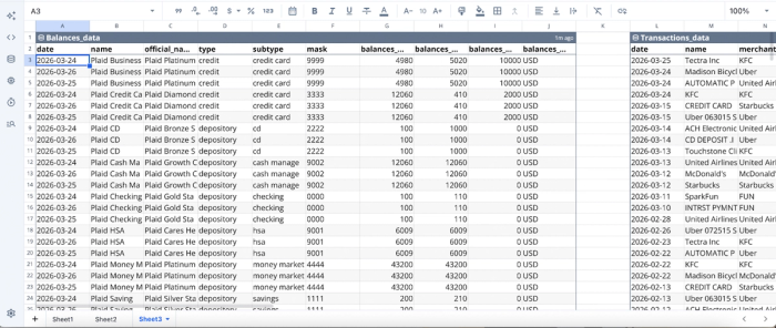
After importing our data into Quadratic, we can proceed with analysis:
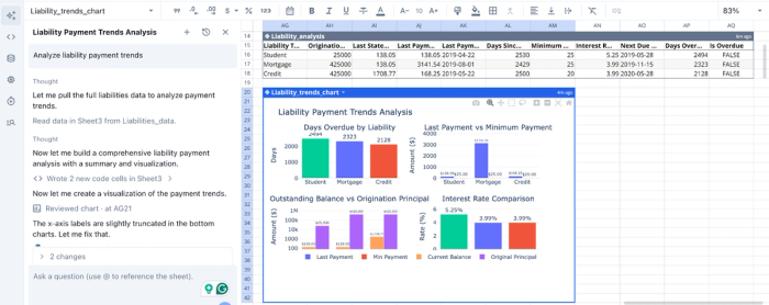
In this image, I simply made a prompt of “Analyze liability payment trends”. Quadratic first generates a table showing the liability analysis of my account, then proceeds to generate several charts to further communicate the analysis. It creates charts for days overdue by liability, last payment vs minimum payment, outstanding balance vs origination principal, and interest rate comparison.
AI data visualization
A key component of effective financial reporting is the ability to communicate insights clearly. Quadratic simplifies this with AI-driven finance data visualization, allowing users to instantly generate charts, dashboards, and reports from live data. This makes it a top contender for the accounting software with the best visual dashboard.
Visualizations in Quadratic are directly tied to underlying data sources, which they update automatically as new data flows in. This ensures that dashboards remain accurate and relevant without requiring manual refreshes.
Let’s see how we can generate visualizations in Quadratic using text prompts:
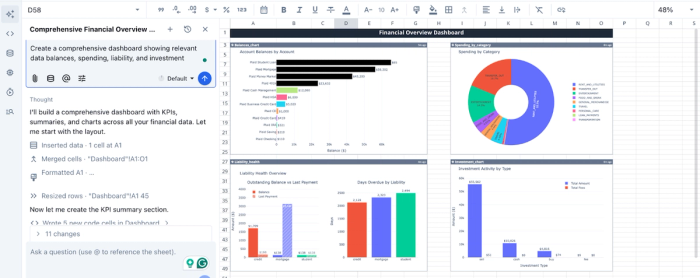
In this screenshot, I ask Quadratic to “Create a comprehensive dashboard showing relevant data balances, spending, liability, and investment,” and it creates a finance dashboard with data pulled live from my Plaid connections.
Native support for modern programming languages
Quadratic extends beyond traditional dashboards by offering native support for programming languages like Python, SQL, and JavaScript. This enables advanced financial analytics, AI data modeling, and database analytics to be performed directly in the reporting environment.
For example, teams can build custom revenue recognition models or create sophisticated forecasting logic without leaving the platform. This flexibility allows organizations to tailor their reporting workflows to their specific needs, rather than being constrained by predefined templates.
Automation and Real-Time Reporting
Quadratic transforms financial reporting from a periodic task into a continuous process. With its built-in Scheduled Tasks feature, users can automate data cleaning, transformation, and reporting workflows.
Recurring processes like data refreshes, report generation, and reconciliation checks can be automated, reducing manual effort and improving consistency.
Collaboration
Quadratic provides a collaborative analytics platform that lets multiple users work on the same data simultaneously.
This eliminates the need for back-and-forth spreadsheet sharing and resolves version control issues. Teams can collaborate on analyses, annotate reports, and align on insights within a single environment.
Conclusion
To eliminate month-end bottlenecks, you must shift your mindset from building a static presentation to building a repeatable workflow. Integrating reconciliation and variance analysis directly into your reporting process ensures faster, more reliable insights that stakeholders can trust.
When you build the best accounting dashboard for financial reporting, you give your team the clarity they need to make strategic decisions. Connect QuickBooks to Quadratic and generate a monthly financial reporting dashboard with variance explanations. Try Quadratic for free.
Frequently asked questions (FAQs)
What defines the best accounting dashboard for financial reporting?
The most effective accounting dashboard for financial reporting is not just a collection of static visuals but a seamless, repeatable workflow. It focuses on ensuring data integrity, providing clear metric definitions, and delivering actionable insights that empower strategic decision-making.
How can I ensure data integrity in my financial reporting dashboards?
To ensure data integrity, embed reconciliation checks directly into the dashboard creation process using specialized tools. This allows for immediate flagging of discrepancies and provides drill-to-source auditability, ensuring stakeholders can trust the numbers presented in your financial reporting.
How does Quadratic help create the best accounting dashboard for financial reporting?
Quadratic streamlines the creation of the best accounting dashboard for financial reporting by connecting directly to live data sources like QuickBooks. It uses AI flows to explore, clean, and summarize data, generating editable logic for P&L trends and variance tables to automate reporting workflows.