
James Amoo, Community Partner
May 26, 2026

Table of contents
- What an online Excel dashboard builder should do
- Step 1: Import your Excel file without breaking the dashboard later
- Step 2: Clean and structure the data before you chart anything
- Step 3: Build the dashboard in the spreadsheet
- Step 4: Keep the spreadsheet and dashboard in sync
- Step 5: Export back to Excel (or keep working in the cloud)
- Create an online Excel dashboard in minutes using Quadratic
- Turn your Excel file into a working dashboard
- Frequently asked questions (FAQs)
Exploring how to build a dashboard in Excel will provide dozens of guides that all assume the same thing: you're sitting in front of desktop Excel, you'll build a few pivot tables, drop in some slicers, and save the file. That's fine if your dashboard lives on one laptop and never needs to be shared or collaborated on. But most people today are looking for something different. They want an online dashboard builder from Excel file and download to Excel workflow that lets them upload a spreadsheet, build something useful in the browser, share it with teammates, and still pull the file back into Excel when they need to.
They don't want to learn a new modeling layer or hand off their data to a separate data visualization tool. They want a better alternative to Excel that happens to handle dashboards well.
This guide walks through the full round trip. Excel in, dashboard out, and Excel out again when you need it. Building Excel dashboards shouldn't mean leaving the spreadsheet paradigm behind, and the workflow below assumes you don't want to.
What an online Excel dashboard builder should do
An online Excel dashboard builder, in the practical sense, is a browser-based spreadsheet that opens .xlsx files and lets you build dashboards directly in the same grid where your data lives. You don't move the data into a different system. You don't model it in a separate semantic layer. You open the file, clean it up, add charts and summary tables next to the data, and share or download the result.
This is a different category from BI tools like Power BI and Tableau. Those are powerful, but they're built for a different job. They come with real overhead. If you just need to turn a quarterly export into a working dashboard for your team, that overhead doesn't pay off.
It's also different from desktop Excel, even though the paradigm is the same. An online Excel dashboard builder should give you the spreadsheet experience you already know, plus collaboration, AI assistance, and shareability that desktop Excel can't match.
This is the space Quadratic is designed for. You can import existing Excel files directly into a browser-based spreadsheet, clean and transform the data using formulas, Python, or SQL, and build dashboards in the same workspace without moving between disconnected tools. AI assistance is embedded directly into the grid, so you can ask for chart recommendations, generate formulas, summarize trends, or explain anomalies inline while working with the actual dataset.
Step 1: Import your Excel file without breaking the dashboard later
The first place dashboards go wrong is at import. A messy Excel sheet that looks fine to a human can confuse any tool that has to parse it programmatically. Before you start building anything, do a quick audit of what you came across.
The most common problems are usually hidden in the workbook structure itself. Merged cells in header rows can split into blanks and disconnected labels. Multi-row headers often need to be flattened before filters, pivots, or formulas work consistently. Date columns may contain multiple formats at once, which silently breaks sorting and grouping logic. Hidden sheets or hidden columns can also create confusion when formulas reference data that the analyst cannot immediately see. Inherited workbooks frequently contain external links to files that no longer exist, while subtotal rows mixed directly into transactional data can distort aggregations without triggering obvious errors.
This is where a spreadsheet-native online tool earns its keep. When something is off, you fix it in the same grid you'll build the dashboard in. You're not bouncing between an import wizard and a re-upload loop. You see the problem, edit the cells, and keep moving.
Step 2: Clean and structure the data before you chart anything
Almost every guide on building dashboards in Excel agrees on one thing: data cleaning is mandatory. Skip it, and your charts will lie to you. The data processing workflow isn't glamorous, but it's the difference between a dashboard that holds up and one that quietly produces wrong numbers.
Once the data is clean, think about shape. Dashboards usually want long-format data (one row per observation, one column per variable) rather than wide-format data (one row per entity, columns spreading across time periods). If your file came out of a report, it's probably wide. Reshaping it now will save you from awkward formulas later. Lookup tables and calculated columns also belong in this step, not after you've started charting.
This is where AI spreadsheet analysis changes the workflow meaningfully. Instead of writing the cleanup formulas yourself, you can describe what you want in plain language, like "split the full name column into first and last name" or "convert the date column to ISO format and flag any rows where the date is missing," and let the AI generate the data transformations directly in the sheet. You still review the result, but you skip the busywork. For most analysts building Excel dashboards, this is the single biggest time saver in the whole process.
Step 3: Build the dashboard in the spreadsheet
With clean data in place, dashboard construction becomes less about mechanics and more about making deliberate decisions around what information actually matters. The best dashboards start from stakeholder questions rather than chart types. “What’s our pipeline by stage this quarter?” or “Which region is underperforming against forecast?” are meaningful analytical questions that shape the structure of the dashboard naturally.
Charts should remain tightly connected to the data they represent. Bar charts, line charts, and category comparisons cover most dashboard needs, and placing each visualization directly beside its supporting data range makes the relationship between numbers and visuals immediately understandable. This design principle is one of the foundations of building dashboards in spreadsheets that age well. The dashboard should act as a transparent analytical layer on top of the data rather than a black box that hides the underlying calculations and assumptions.
Interactivity can also be achieved without relying on overly complex dashboard objects or heavy BI tools. In spreadsheet-driven workflows, interactivity often comes from simple input cells tied directly into formulas and charts. Date ranges, regional selectors, product filters, or scenario assumptions can all live in clearly labeled cells that dynamically update the rest of the dashboard when changed. This creates the same practical effect as slicers or interactive controls while remaining far easier to inspect and extend.
Step 4: Keep the spreadsheet and dashboard in sync
A lot of dashboard advice treats the dashboard as a one-time deliverable. You build it, you screenshot it, you move on. That's why so many dashboards output stale data within a few weeks.
The better design principle: the dashboard reads from the same sheet you keep editing. There's no separate "data layer" that has to be refreshed through a special process. When the underlying data changes, the dashboard changes.
For teams, this also means thinking about collaboration and versioning. A spreadsheet-native online tool gives multiple people access to the same dashboard without sending file copies around. That's how the dashboard stays the source of truth instead of becoming five slightly different versions sitting in five different inboxes.
Step 5: Export back to Excel (or keep working in the cloud)
The step most guides skip entirely is the round trip. Building a dashboard online is only half the workflow; in many real business environments, the final deliverable still needs to exist as an Excel file. Teams regularly need downloadable spreadsheets for reporting cycles, audit requirements, stakeholder reviews, or operational systems that still depend on .xlsx files as their standard format. If the transition back to Excel breaks formulas or strips formatting, the workflow becomes difficult to trust in production settings.
At the same time, not every workflow should immediately return to a downloaded spreadsheet. Online environments are often significantly better for active collaboration and continuously evolving analysis. When multiple users are iterating on the same dataset or when dashboards need to update dynamically as new data arrives, staying in a shared browser-based environment usually provides a smoother experience than repeatedly exporting static snapshots. The decision depends less on the tool itself and more on how the dashboard will actually be consumed by stakeholders and downstream systems.
What ultimately determines whether a workflow is truly round-trip capable is what survives the export process. At the minimum, formulas, formatting, and core analytical logic should transfer cleanly back into Excel without requiring manual reconstruction. Otherwise, the export is effectively just a screenshot packaged as a spreadsheet.
Create an online Excel dashboard in minutes using Quadratic
Quadratic was built for exactly this kind of work: a spreadsheet-native, browser-based environment where Excel files become living dashboards rather than static outputs.
It opens .xlsx files directly, with formulas and structure intact, so you can pick up where you left off in desktop Excel. Let’s explore the features of Quadratic in detail.
Connect dashboards directly to live operational data
One of the biggest weaknesses of static spreadsheet dashboards is that they age immediately after export. The dashboard becomes a snapshot rather than an ongoing reporting system, forcing analysts into repetitive manual refresh cycles.
Quadratic supports direct connections to databases, APIs, and external datasets, allowing dashboards to stay connected to live operational data sources. Sales dashboards can pull updated sales data visualization, accounting dashboards can refresh transaction data, and operational reporting can sync with recurring exports without rebuilding the workflow every reporting cycle.
This transforms dashboards from one-time deliverables into continuously reusable analytical systems. The same spreadsheet evolves alongside the business data instead of being discarded and recreated every month.
Build dashboard logic with formulas, Python, and SQL together
Traditional spreadsheet dashboards often hit a ceiling when the logic becomes too complex for formulas alone. Analysts end up moving between Excel, Python notebooks, SQL queries, and visualization tools just to complete one reporting workflow.
Quadratic removes those boundaries by supporting formulas, Python, and SQL in the same environment. Simple calculations can stay as spreadsheet formulas, while heavier transformations, joins, forecasting logic, or statistical analysis can move into Python or SQL without leaving the dashboard workspace.
This creates a much more scalable dashboard architecture. Instead of maintaining disconnected tools and fragile exports, teams can centralize their logic directly inside the spreadsheet environment where the final reporting happens.
Clean and reshape dashboard data with AI in the sheet
A large percentage of dashboard work happens before the first visualization is ever built. Columns need to be cleaned, date formats normalized, duplicate records removed, and inconsistent categories reconciled. In most workflows, this prep work is scattered across formulas, helper tabs, scripts, and external cleanup tools.
Quadratic compresses that process by embedding AI agents for analysis directly into the spreadsheet itself. You can ask the AI to identify anomalies, restructure tables, or explain why a dataset is producing inconsistent results.
Let’s see how this works using a sample of dirty Excel data:
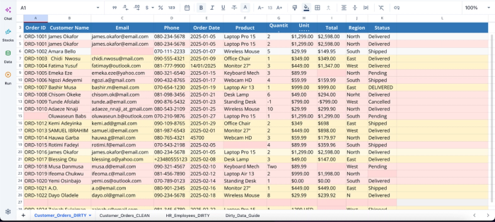
This dataset contains several inconsistencies, including duplicate rows, wrong date formats, and invalid data. With Quadratic, you do not need to write complex formulas or scripts to clean this data before visualization; all you need to do is ask using text prompts:
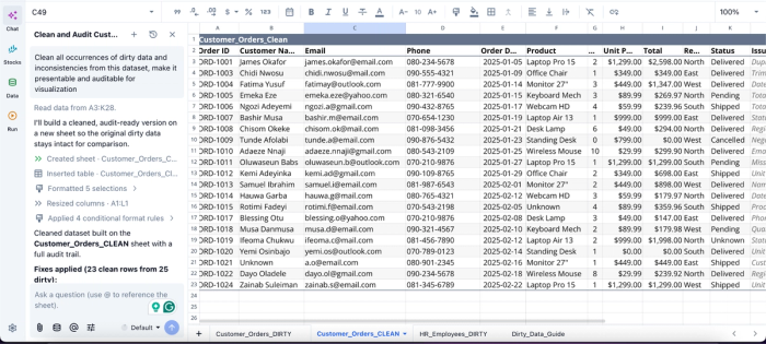
In this image, I ask Quadratic AI to “Clean all occurrences of dirty data and inconsistencies from this dataset, make it presentable and auditable for visualization.” It creates a separate sheet that presents the cleaned dataset free from all dirty data. As an AI spreadsheet analyzer, it also provides a fully transparent logic that allows users to audit the process behind the result.
Generate AI-powered charts and narrative summaries
Building the chart is usually only half the job. Teams still need to explain what changed, identify trends worth paying attention to, and communicate findings to stakeholders who may never open the raw spreadsheet.
Quadratic integrates AI-powered visualization and summarization directly into the dashboard workflow. Using an Excel AI graph generator, analysts can generate charts from selected ranges, ask AI to identify outliers or performance drivers, and produce narrative summaries that explain the meaning behind the numbers.
Here’s an example:
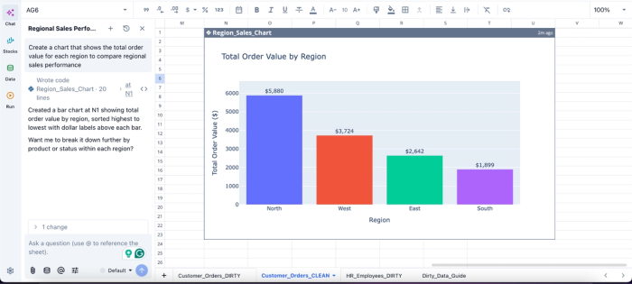
In this image, I ask Quadratic AI to “Create a chart that shows the total order value for each region to compare regional sales performance.” In seconds, it generates a bar chart that shows the total order value by region. From this chart, we can see that the North region has the highest order value with $5,880.
Keep dashboards collaborative instead of file-bound
Traditional Excel dashboards are notoriously difficult to collaborate on at scale. Files get duplicated across email threads, and reporting logic becomes trapped on one person’s machine.
Quadratic replaces that fragmentation with a real-time collaborative analytics platform where teams work inside the same live dashboard. Analysts can validate calculations together, operators can annotate anomalies directly in the sheet, and decision-makers can review the same up-to-date dashboard without waiting for exports or screenshots.
Export when needed without losing the workflow
Even modern dashboard workflows still need to coexist with Excel-heavy ecosystems. Finance teams may require .xlsx deliverables, leadership may want offline copies, or downstream systems may still depend on spreadsheet files.
Quadratic supports exporting dashboards back to Excel while preserving formulas and structure, making it possible to maintain a modern browser-based workflow without abandoning compatibility with existing spreadsheet processes.
That flexibility matters because it lets teams modernize incrementally. You get the advantages of AI Excel analysis, live collaboration, and integrated dashboarding during the build process, while still delivering outputs in the spreadsheet formats organizations already rely on.
Turn your Excel file into a working dashboard
A reliable online dashboard builder from Excel file and download to Excel workflow is straightforward once you see it as a round trip: import your Excel file, clean and structure the data, build the dashboard with summary tables and charts in the sheet, keep the dashboard in sync with the underlying data, and export back to Excel whenever you need to.
The thesis is simple. The spreadsheet is the dashboard environment, not a data source for a separate visualization layer. When you keep your dashboard inside the spreadsheet, you keep the logic visible, the data fresh, and the workflow familiar. You skip the BI overhead and still get something your team can actually use.
Upload your Excel file to Quadratic and turn it into a dashboard you can analyze, share, and keep working with in spreadsheet form. Try Quadratic for free.
Frequently asked questions (FAQs)
Can I build a dashboard from an Excel file without using desktop Excel?
Yes. Modern browser-based spreadsheets open .xlsx files directly, preserve your formulas and formatting, and let you build the dashboard in the same grid. You don't need desktop Excel at any point in the workflow, though you can still export back to .xlsx whenever you want a local copy.
How does Quadratic help with building Excel dashboards?
Quadratic opens .xlsx files directly with formulas and structure intact, includes an AI assistant for cleaning and reshaping data in the same workspace, and lets you build charts and summary tables natively in the sheet. This eliminates the need to move data into a separate BI tool, compresses the prep work that usually slows dashboard projects, and keeps the logic visible and collaborative throughout the entire workflow.
Do I need a BI tool, or is a spreadsheet enough?
For most ad hoc and team-level dashboards, a spreadsheet is enough, especially if it includes charting, AI assistance, and collaboration. BI tools become worth the overhead when you have governed enterprise data, large audiences, and strict requirements around data modeling. If you're starting from an Excel file and want to build something useful for your team this week, a spreadsheet-first tool is almost always the faster path.
