
James Amoo, Community Partner
Apr 30, 2026

Basic traffic metrics like pageviews and bounce rates tell you people are visiting your application, but they fail to explain actual user behavior or drive key user activation metrics. Product managers need to leverage product usage analytics to know exactly how users interact with features to make meaningful improvements. Finding the best user analytics for product teams requires a strategic approach that prioritizes deep investigation and seamless actionability.
In this article, we will explore how to evaluate analytics platforms, implement strong instrumentation best practices, and translate raw event data into tangible UX improvements.
Core evaluation criteria for user analytics tools
When evaluating user analytics for product teams, the decision often comes down to balancing accessibility with depth. Today, the focus has shifted toward self-serve analytics, including advanced AI tools for product managers that empower them to answer their own questions quickly.
Scalability is a foundational requirement as your product grows. An analytics platform must be able to handle increasing event volume without slowing down queries or limiting data retention. As your user base expands and interactions multiply, the system should continue to deliver consistent performance so that insights remain reliable and timely.
Operational efficiency is equally important for day-to-day use. Teams need quick access to pre-built dashboards that provide a snapshot of key product management metrics without requiring complex setup. At the same time, the platform should support deeper data exploration when needed.
Integration capabilities are also important. Your analytics tool cannot exist in isolation; it needs to connect smoothly with your broader data stack, pulling and pushing data to databases for robust database analytics.
Translating analytics into UX and activation improvements
Collecting high-quality data is only the first step. Funnel analysis is one of the most effective methods for diagnosing onboarding friction. By visualizing the sequence of steps a user takes to reach activation, you can pinpoint the exact moment where users drop off. If a significant percentage of users abandon your product at a specific configuration step, you have a clear mandate to simplify that part of the UX.
For understanding long-term retention, cohort tracking and feature adoption metrics are essential methodologies. Grouping users by their signup date or the specific features they use allows you to observe behavioral trends over time, a process referred to as cohort analysis. This helps you determine which product updates actually drive sustained engagement and which features might need to be redesigned or deprecated.
To turn these insights into real improvements, teams need to close the loop between analysis and execution. This means prioritizing changes based on measurable impact, running controlled experiments such as A/B tests, and continuously monitoring results after implementation.
Enriching product data with business context
Standard analytics approaches often suffer from a major blind spot. Product behavior data is frequently siloed away from broader business metrics. Knowing that a user clicked a button is helpful, but true behavioral understanding requires combining those product events with internal data like customer lifetime value or support ticket volume.
Relying entirely on pre-built dashboards limits a product manager's ability to ask complex questions. If you want to know if a specific onboarding flow correlates with a decrease in support tickets or an increase in long-term revenue, standard conversion tracking tools usually fall short.
To truly understand the impact of product changes, teams need a flexible analysis environment. Bridging these data silos allows product managers to look beyond simple engagement metrics and connect UX improvements directly to tangible business outcomes.
How Quadratic unifies user analytics for deep investigation
Modern user analytics often suffers from fragmentation across tools like product analytics platforms, web analytics, and databases. Each system captures a different slice of user behavior, but rarely provides a complete picture. Quadratic solves this by acting as a unifying layer where all user data can be combined and explored within a flexible workspace.
Direct connections to multiple data sources
Quadratic integrates directly with platforms like Mixpanel, Google Analytics, and internal databases, allowing teams to pull user event data alongside operational and financial data analytics. This eliminates the need for manual data stitching across systems.
With unified access to multiple sources, teams can analyze user behavior in full context. For example, product engagement can be directly tied to support interactions or revenue outcomes.
AI-powered data analysis
Quadratic leverages AI to help teams explore complex user datasets, identify behavioral patterns, and generate analytical logic on demand. This includes segmenting users and uncovering hidden correlations.
By reducing the manual effort required for query and data transformation, AI allows teams to focus on interpreting results. This accelerates the process of uncovering actionable insights from large datasets. Let’s see how this works.
First, I import my product data (Quadratic also supports direct connection to your product analytics platforms):
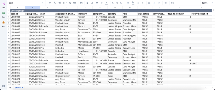
In this dataset, we’re working with 1,000 rows of user data covering key performance metrics. With Quadratic, extracting insights from data at this scale can be done by simply using text prompts. Here’s an example:
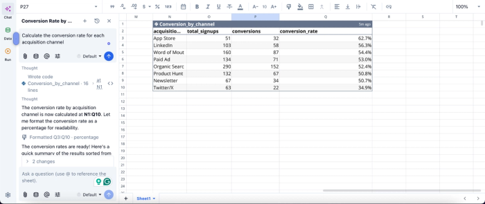
In this image, I ask Quadratic AI to “Calculate the conversion rate for each acquisition channel.” It instantly generates a table that gives insights into total signups, number of conversions, and conversion rate for each acquisition channel.” Quadratic speeds up insight generation as users can conduct advanced analysis by simply using text prompts.
AI data visualization
Quadratic enables the creation of flexible visualizations that adapt to exploratory workflows. Teams can quickly generate different chart types to analyze user flows or feature engagement without leaving the workspace.
Since visualizations are directly tied to the underlying data, they update dynamically as queries or filters change. This supports exploratory data analysis, where insights evolve as new questions are explored. Visualization in Quadratic is also done by using text prompts. Here’s an example:
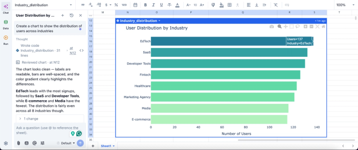
In this image, I ask Quadratic AI to “Create a chart to show the distribution of users across industries.” In seconds, it generates an interactive chart that gives insights into the user distribution by industry. Users can also fine-tune these generated charts to their preference, as they are highly customizable.
Native support for programming languages
With built-in Python, SQL data analytics, and spreadsheet formulas, Quadratic provides the flexibility needed for deep analytical work. Teams can write custom queries and build advanced models directly within the grid.
This is critical for user analytics, where standard dashboards often fall short. By combining code and spreadsheet logic, teams can tailor their analysis to their exact needs.
Flexible segmentation and cohort analysis
Quadratic allows teams to define custom user segments and cohorts based on behavioral or transactional criteria. These segments can be dynamically updated as new data is ingested.
This supports a deeper investigation into how different user groups interact with the product. It enables more targeted insights and more effective product decisions.
Real-time collaboration for cross-functional analysis
Quadratic supports real-time collaboration, allowing product managers, data analysts, and engineers to work together on the same datasets and models. This collaborative analytics platform reduces silos and improves alignment.
Collaboration ensures that insights are validated across perspectives. It also enables faster iteration, as teams can collectively refine queries and interpretations in real time.
Conclusion
Improving user experience and driving activation demands a strategic framework where you select the best user analytics for product teams based on their flexibility and enrich standard event data with broader business context.
The ultimate goal is to empower product managers to iterate quickly. Quadratic supports direct connection with product analytics tools like Mixpanel and Amplitude, allowing you to build user analytics dashboards with ease. Try Quadratic for free.
Frequently asked questions (FAQs)
What defines the best user behavior analytics tools for product analytics?
The best user behavior analytics tools for product analytics balance accessibility with depth, allowing for quick daily check-ins and deep custom exploration. Key factors include scalability to handle growing event volume, operational efficiency, and seamless integration with your existing data stack to ensure a single source of truth.
How does Quadratic help product teams achieve better user analytics?
Quadratic empowers product teams to unify siloed product behavior data with broader business metrics within a familiar spreadsheet interface. This allows for custom analyses using native Python, SQL, and formulas, moving beyond rigid dashboards to connect UX improvements directly to tangible business outcomes.
What methods help translate user analytics into UX and activation improvements?
Funnel analysis is effective for diagnosing onboarding friction by pinpointing exact user drop-off points, while cohort tracking and feature adoption metrics are essential for understanding long-term retention. These metrics allow product teams to identify specific areas for UX simplification or redesign to drive sustained engagement.