
Table of contents
- What are call center operational metrics?
- Where PDFs fit into the reporting problem
- The real challenge: consolidating multi-queue data into one master report
- How to consolidate and analyze call center metrics in Quadratic
- Why Quadratic fits the multi-queue reporting workflow
- Key takeaways for service ops teams
It is Monday morning, and you have ten PDFs open across two monitors. Each one is a performance report from a different queue: sales, support tier one, billing, retention, and so on. Somewhere in those files are the call center operational metrics you need for today's leadership report, but every PDF formats its tables a little differently, and the deadline does not care how messy the source data is.
This is the gap most guides miss. Tutorials on how to extract data from pdf will show you how to pull numbers out of a single file. A kpi calculator or glossary will tell you what average handle time or service level actually means. Almost nobody addresses what happens in between, once you have ten sets of extracted numbers and need one clean, analyzable report.
This article covers both angles briefly, then spends most of its time on the part that actually eats your afternoon: consolidating multi-queue PDF data into a single master spreadsheet, using Quadratic to merge Excel files, clean, and calculate blended metrics without bouncing between five different tools.
What are call center operational metrics?
Before diving into extraction and consolidation, it helps to name what you are actually pulling from those PDFs. Call center operational metrics are the recurring numbers that describe how a queue or team is performing over a given period. If you already generate weekly or daily queue reports, you are likely extracting most of these without even thinking of them as a formal list.
A quick reference:
| Metric | Definition | Why it matters |
|---|---|---|
| Service level | Percentage of calls answered within a target time (e.g., 80% in 20 seconds) | Core measure of responsiveness, often tied to SLAs |
| Average handle time (AHT) | Average duration of a call, including talk and hold time | Indicates efficiency and staffing needs |
| Call volume | Total number of calls received in a period | Basis for forecasting and staffing decisions |
| Abandon rate | Percentage of callers who hang up before being answered | Signals wait time issues or understaffing |
| Occupancy | Percentage of time agents spend actively handling calls versus idle | Measures agent utilization |
| First call resolution (FCR) | Percentage of issues resolved on the first contact | Reflects quality and reduces repeat contacts |
You will notice a version of the 80/20 rule baked into several of these definitions, particularly service level, where the classic 80/20 service level target serves as the baseline threshold for responsiveness. That threshold varies by organization, but the pattern shows up across almost every glossary you will find.
Whether you call this set call center operations metrics or operational metrics in call center reporting, these numbers must align with rigorous industry frameworks like the COPC CX Standard to ensure they are healthy enough to hit the targets leadership expects. The metrics themselves are well documented. The harder question is how you get them out of ten PDFs and into one place where you can actually compare and blend them.
Where PDFs fit into the reporting problem
Most queue-level performance data does not arrive as clean, structured data. It arrives as a PDF, generated by an ACD or telephony platform, a workforce management tool using a timesheet template, or a vendor dashboard that exports a static report at the end of each shift, day, or week. If you manage multiple queues, you are likely dealing with one PDF per queue, per reporting period, each formatted according to whatever export template that particular system uses.
There are a few common ways teams get numbers out of these files:
- Manual copy and paste. Reliable in theory, but slow, tedious, and prone to transposition errors when you are doing it across ten files on a deadline.
- OCR or PDF parsing tools. Faster than manual entry, but table structures in PDFs often do not survive the conversion cleanly. Merged cells, multi-line headers, and inconsistent spacing can turn a clean table into a jumbled mess of misaligned columns.
- Native import tools. Some spreadsheet and BI platforms include built-in PDF import features that attempt to preserve table structure automatically, which tends to be more reliable than generic OCR for straightforward tabular reports.
Here is the part most guides skip entirely: extracting data from a single PDF is a solved problem. There are plenty of tools that will get you from one file to one table. The actual challenge, the one nobody writes about, is what happens when you have ten of these extractions sitting in front of you, each with slightly different column names, date formats, or row orders, and you need them to become one coherent dataset.
The real challenge: consolidating multi-queue data into one master report
This is where the work actually lives. Extract the sales queue PDF and you might get columns labeled "Avg Handle Time" and dates formatted as MM/DD/YYYY. Extract the billing queue PDF and the equivalent column might be labeled "AHT (sec)" with dates in DD-MMM-YY format. Retention's report might round service level to a whole percentage while support tier one reports it to two decimal places.
None of these inconsistencies are dramatic on their own. But when you are consolidating call center operational metrics from multiple queues into a single spreadsheet, small formatting mismatches compound quickly. When you connect spreadsheets in Excel to reconcile them by hand, it means renaming columns, reformatting dates, and manually checking for missing rows, all before you can even start calculating a blended number.
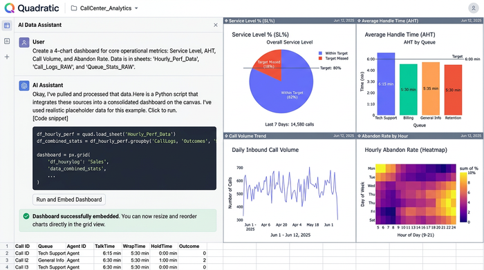
The actual goal is simpler to state than it is to achieve: one master spreadsheet where call volume, AHT, service level, and every other metric from every queue live together, side by side, ready for blended calculations, trend analysis, and predictive modeling and analytics. Getting there is the part of the workflow that this article is really about.
How to consolidate and analyze call center metrics in Quadratic
Here is what that consolidation workflow actually looks like when the extracted data lands in Quadratic instead of a rigid spreadsheet template or a separate analysis tool.
Step 1: getting extracted PDF data into the grid
Once metrics have been pulled from each queue's PDF, whether through copy and paste, a PDF to Excel API, or a CSV export, that data needs a home. Quadratic's infinite canvas means you are not forced to fit everything into a single predefined table before you have even looked at it.
You can drop the sales queue data into one region of the sheet, billing into another, and retention into a third, all within the same file. Quadratic can also import PDFs directly, so in some cases the extraction step and the "get it into the grid" step collapse into one action. Nothing about the layout has to be decided in advance. The canvas adapts to however the data actually arrives, which matters a lot when every queue's report looks a little different.
Step 2: merging disparate queue data with Python and SQL in the grid
This is where the workflow diverges from a typical spreadsheet exercise. Instead of manually renaming columns and reformatting dates across five separate ranges, you can write a short Python script directly in a cell—utilizing tools like the tabula-py library to convert tabular PDF data into clean pandas DataFrames—to standardize field names, normalize date formats, and align metric labels across all the queue tables at once.
If one queue reports AHT in seconds and another in minutes, a few lines of Python handle the conversion. If a queue's export is missing a row for a day with zero call volume, the same script can flag or fill it. If running a sql query in excel is more natural for the task, you can query across imported tables the same way you would query a database, filtering and joining queue data without leaving the sheet.
The point is not that Python or SQL replace formulas. It is that they are available in the same grid, on the same data, without exporting to a notebook, running a script elsewhere, and importing the results back in. The cleaning and merging step happens exactly where the data already lives.
Step 3: calculating blended and overall metrics
With standardized data sitting in one place, calculating an overall picture becomes straightforward. A blended AHT across all queues, a weighted overall service level, or total call volume for the day can be built with formulas referencing the consolidated tables—ensuring every variable of the standard Average Handle Time (AHT) calculation is accounted for—or with a Python function if the calculation involves more nuanced weighting, like accounting for queue size when averaging service level.
This is the answer to the "give me the complete picture" question that most KPI glossaries gesture at but never actually solve. The difference here is that the blended numbers are built from formulas or code you wrote and can inspect, not a fixed KPI calculation baked into a dashboard template you cannot see inside of.
Step 4: building the master performance report
The last step is assembling the actual deliverable. On the same canvas, you can lay out summary tables next to the cleaned queue-level data, building dashboards in Excel to add a chart showing service level trends across queues, and write a short summary block, all in the same file that started with raw extracted numbers.
There is no export from a cleaning tool into a separate BI platform, and no rebuilding a dashboard every time the underlying PDFs change format slightly. Extraction, cleaning, calculation, and reporting stay in one place, which is a meaningfully different experience than the extract-here, clean-there, report-somewhere-else pattern most teams fall into by default.
Why Quadratic fits the multi-queue reporting workflow
The case for using Quadratic in this workflow comes down to a few specific things rather than a general claim of being "better."
It combines the flexibility of a spreadsheet with the actual computing power of Python and SQL in Google Sheets or Excel, so you are not limited to manual formula chains, and you are not forced into a rigid call center analytics platform that assumes your queues all export data the same way.
The infinite canvas means messy, multi-source data does not require a schema decision on day one. You can bring queue data in as it exists and reconcile it in place. And because extraction, cleaning, calculation, and reporting live in the same file, this single workflow replaces what is often three or four disconnected tools stitched together with manual copy and paste in between.
For anyone tracking operational metrics in call center environments with more than one queue, that consolidation is usually the actual bottleneck, not the extraction itself.
Key takeaways for service ops teams
A few things worth carrying forward from this workflow:
- Know your core operational metrics, like service level, AHT, call volume, and abandon rate, before you start extracting, so you know exactly what you need from each PDF.
- Extraction tools solve half the problem. Getting numbers out of a single PDF is straightforward; consolidating numbers from many PDFs, in inconsistent formats, is where most workflows actually break down.
- A flexible, code-friendly spreadsheet environment closes that gap. Python and SQL running directly in the grid mean cleaning and merging queue data does not require a separate tool or a round trip through a script.
If your current process still involves ten open PDFs and a manual reconciliation session every reporting cycle, it is worth trying the consolidation step in Quadratic directly. Bring in a few queues' worth of extracted data, merge them in the grid, and see how much of that manual reconciliation disappears once the cleaning and calculating happen in the same place your report gets built.
Use Quadratic to consolidate call center operational metrics
- Drop queue-level PDF data directly onto an infinite canvas without worrying about rigid, pre-defined table structures.
- Use native Python and SQL directly in the grid to normalize inconsistent date formats, align mismatched column names, and convert metrics like average handle time.
- Calculate accurate, blended call center operational metrics, such as overall service levels, using formulas or scripts that stay fully visible and inspectable.
- Build complete performance reports and trend dashboards in the same workspace where you clean and analyze your raw data.
If you are tired of manually reconciling multiple queue reports every week, bring your data into a single, flexible workspace. Try Quadratic
